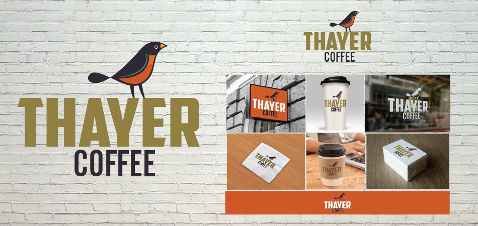
Thayer Coffee
The Grubbery Food Truck

About Moonlit Fox Graphics

Thayer Coffee
The Grubbery Food Truck

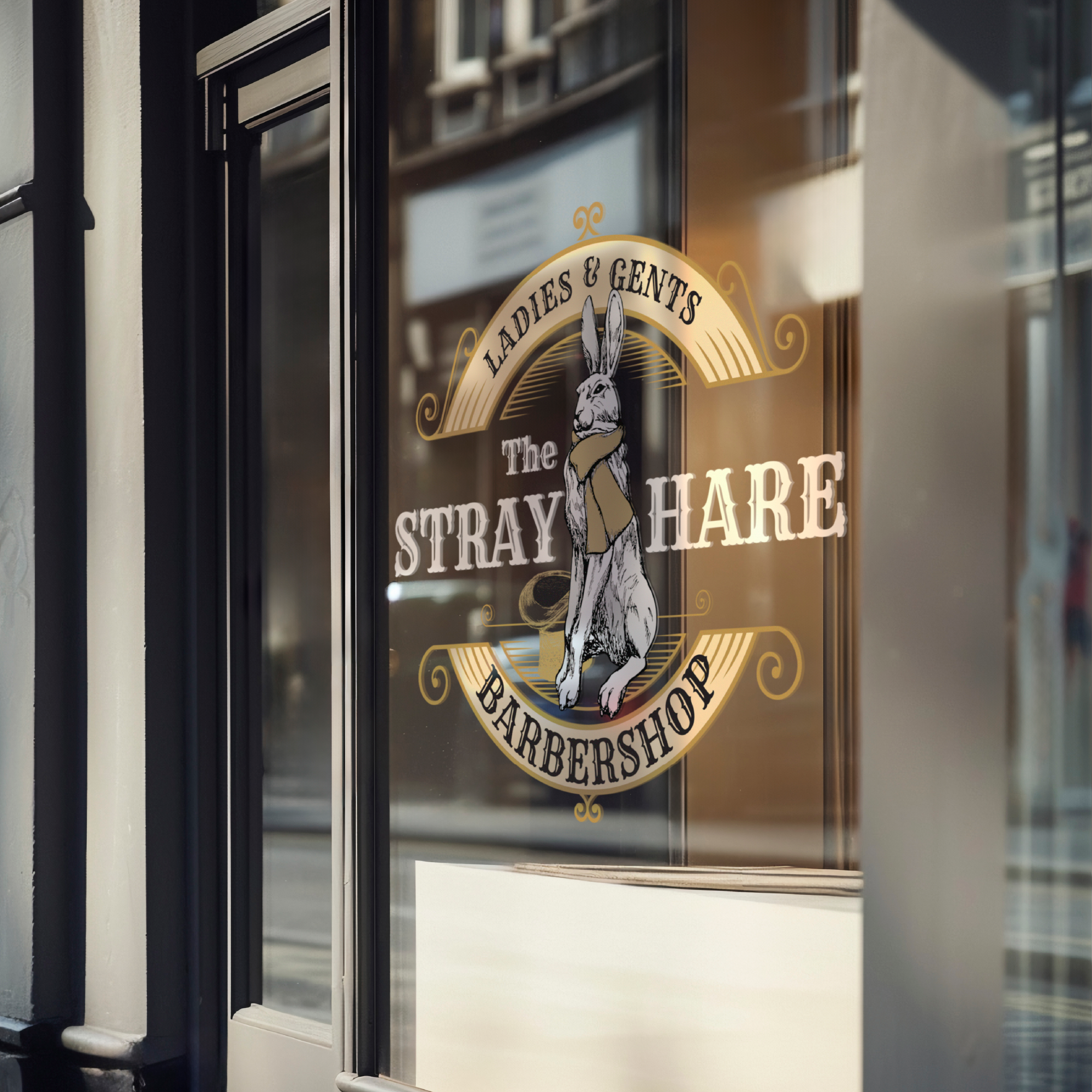
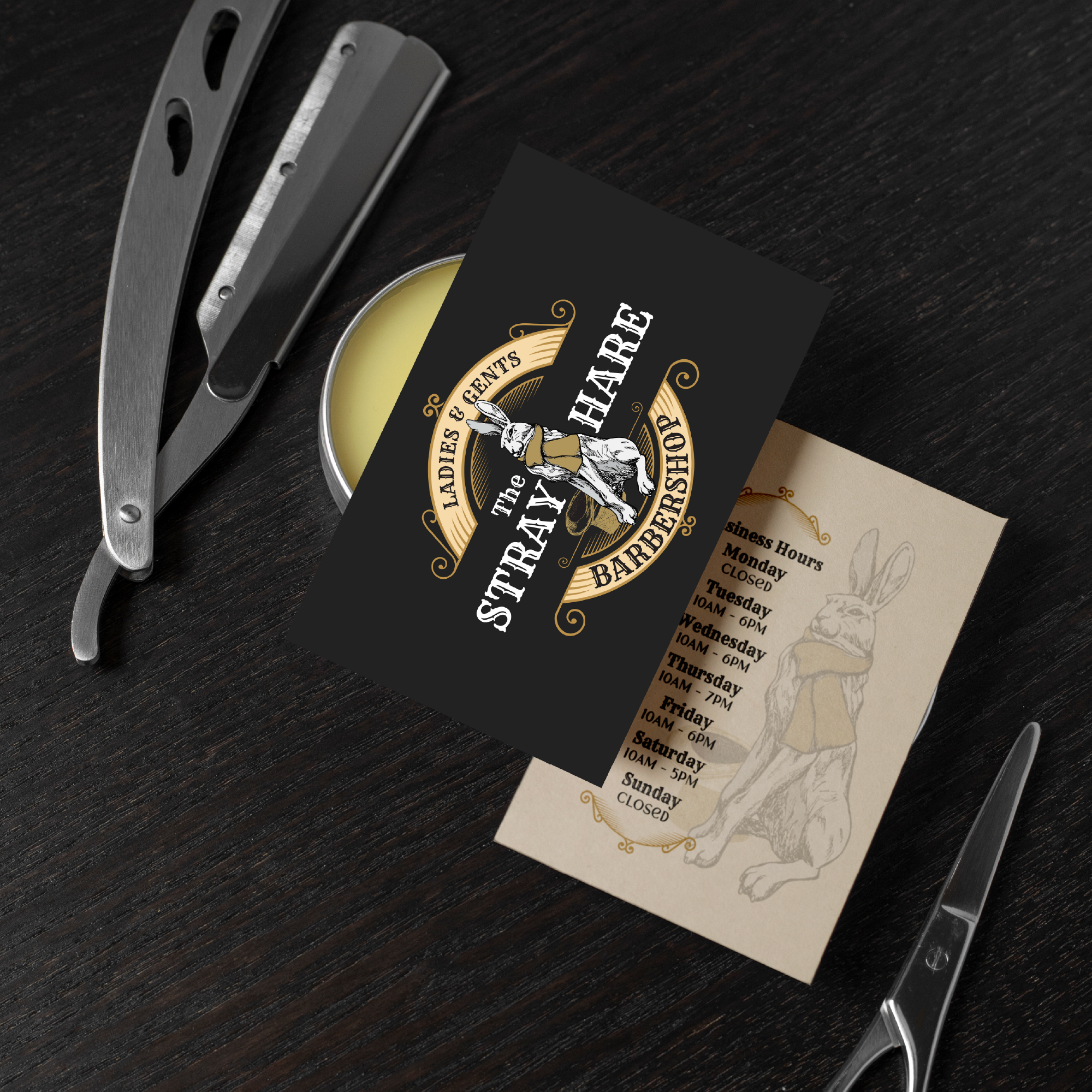
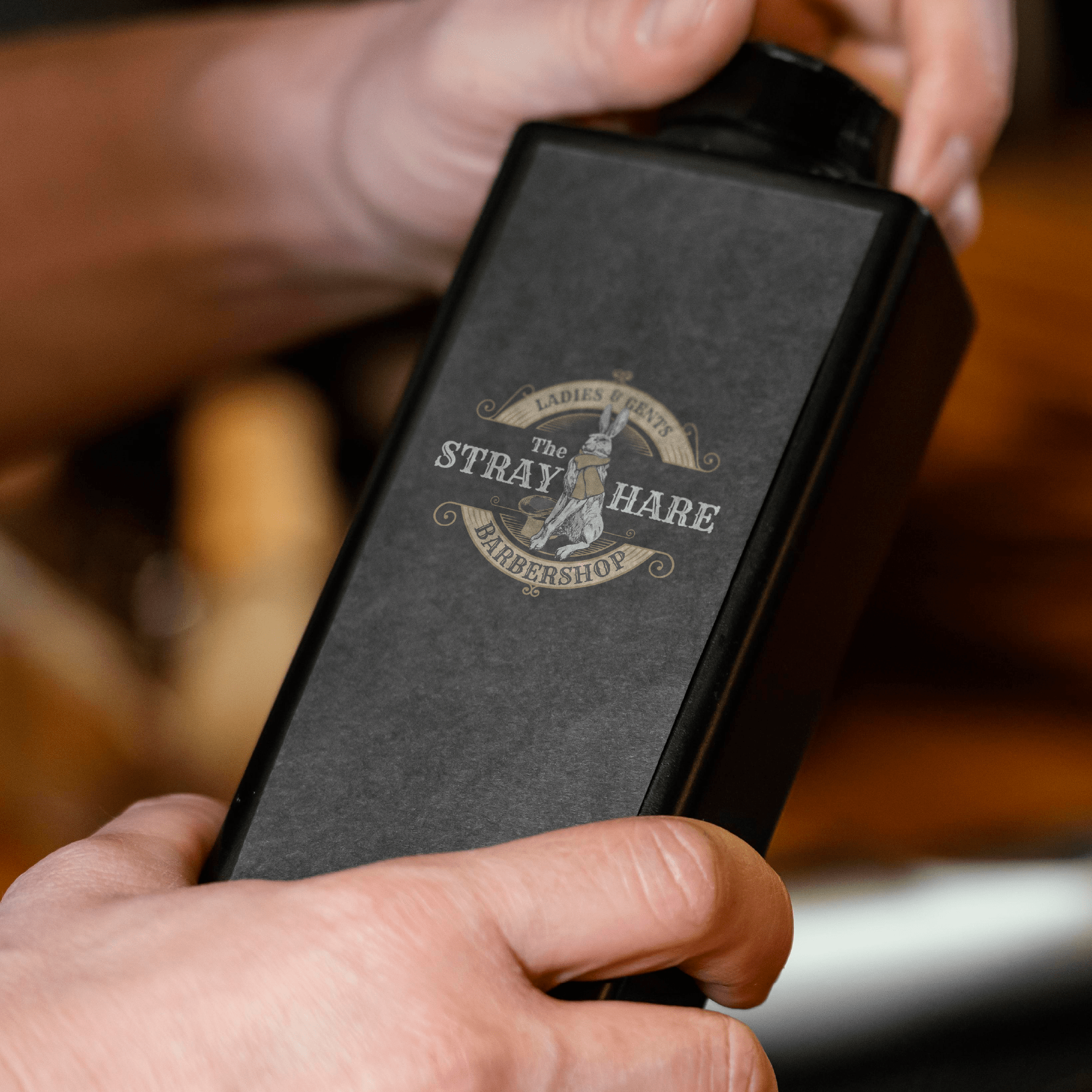
THE STRAY HARE logo

ELEVEN WHOLE FOODS:  logo+packaging

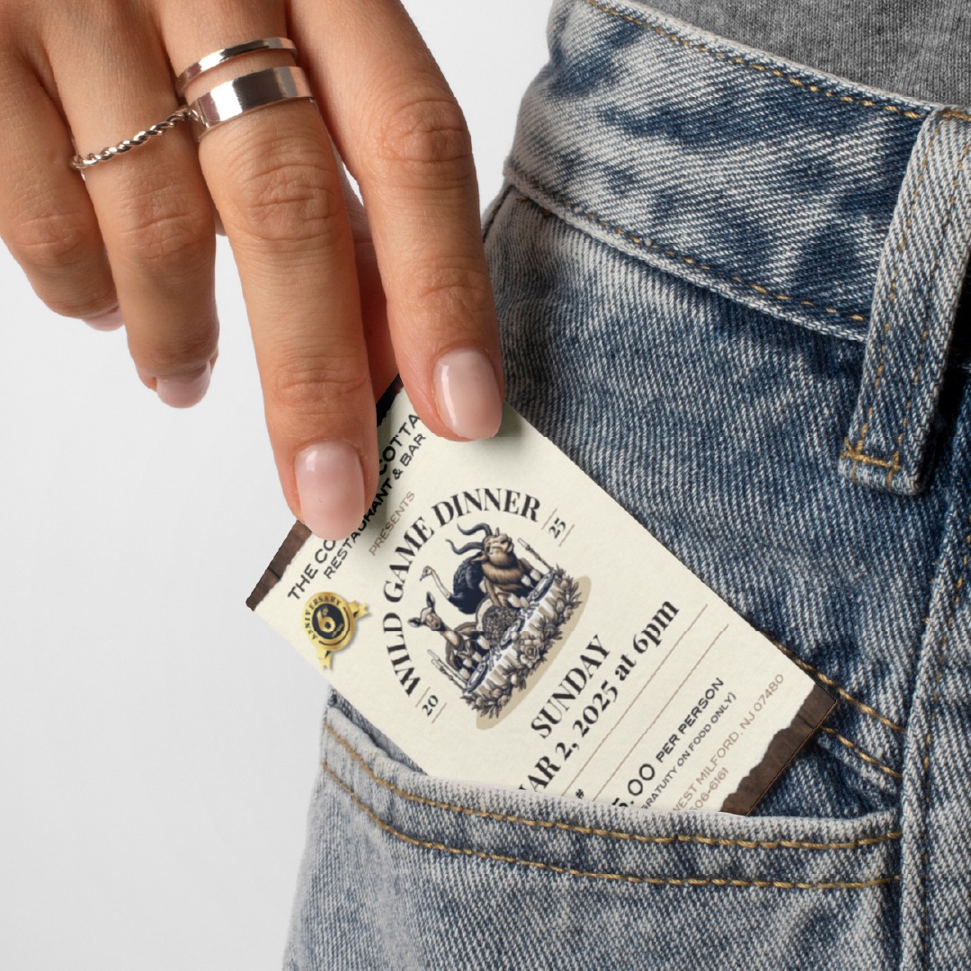
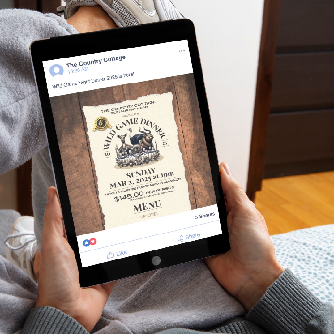
WILD GAME NIGHT:  logo+menu

OKTOBERFEST

BAR12: logo+menu

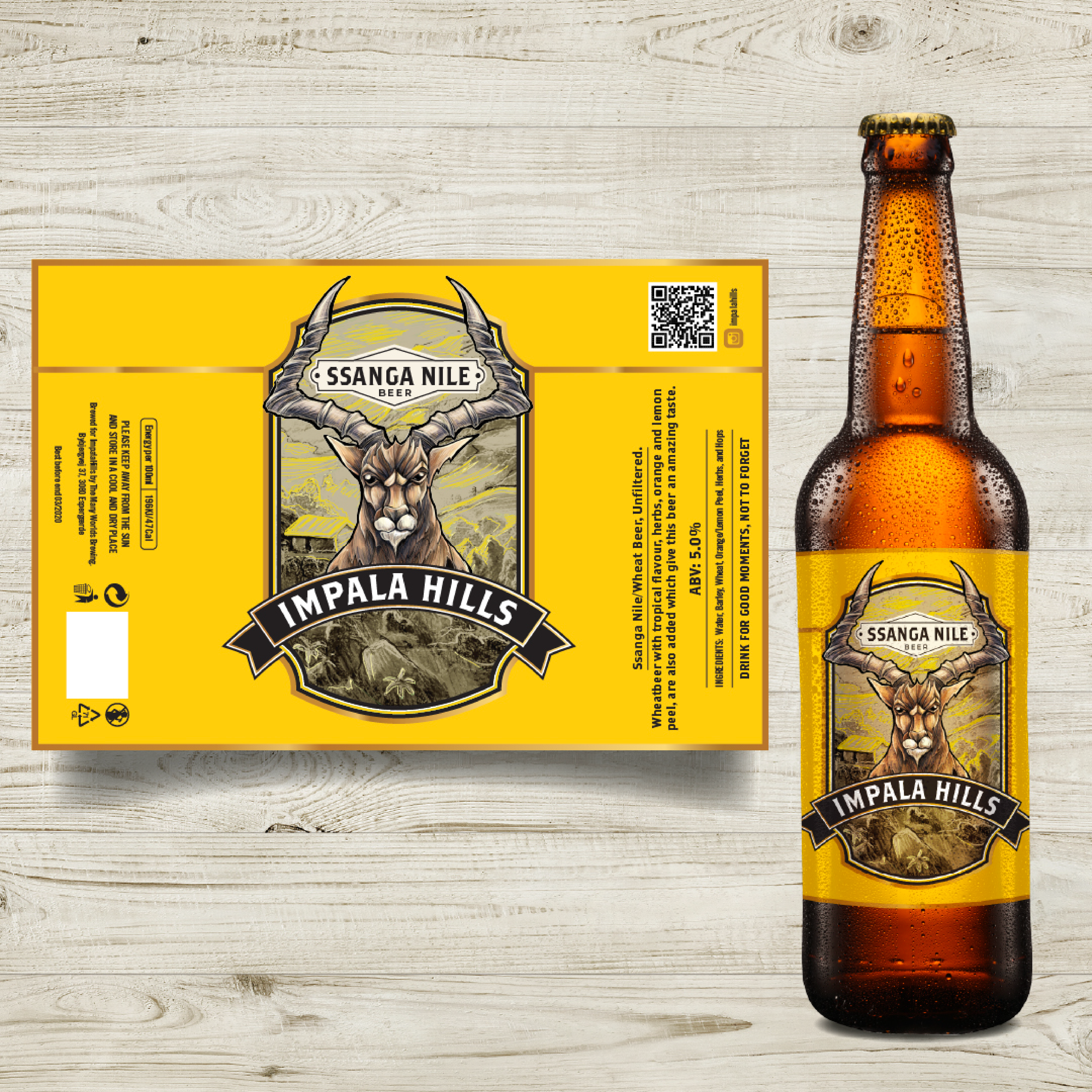
IMPALA HILLS: label

CUTTY’S: logo+

NIKO’S: menu designs

MONKEY PAW:  logo+

F*RK THIS:  logo+menu+packaging

OWL MOON

THIRST:  logo+

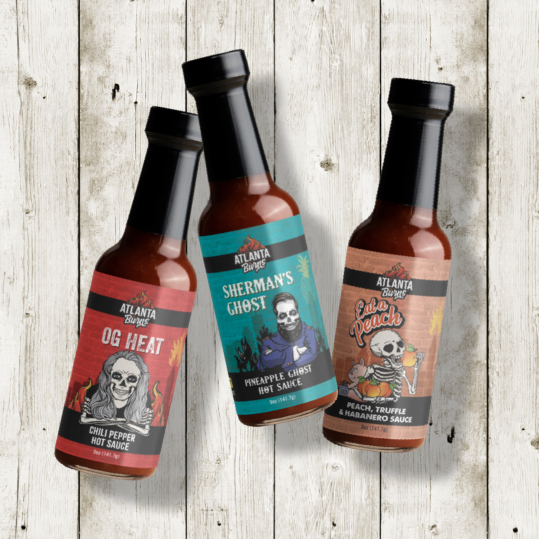
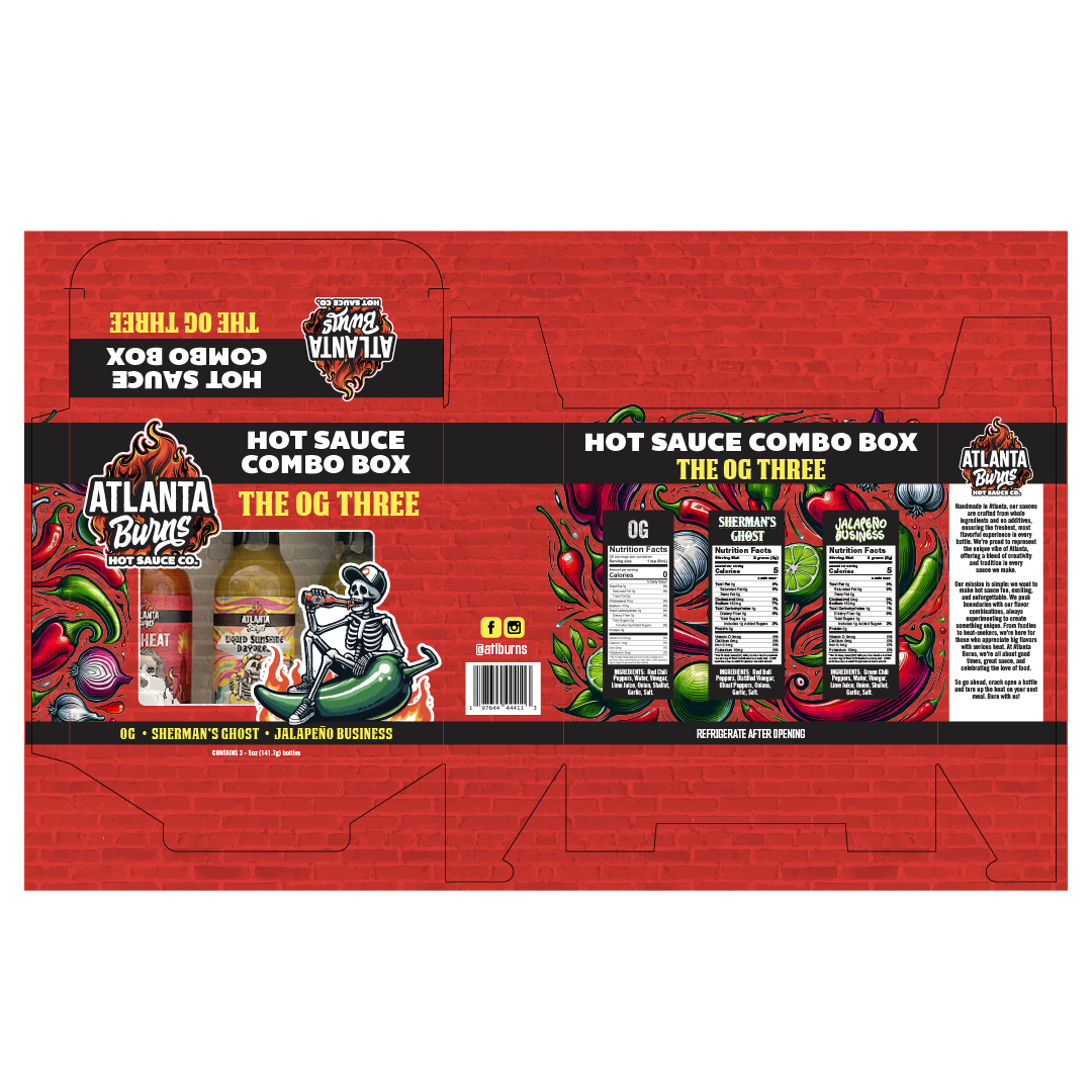
ALTALTA BURNS:  logo+packaging

TAVERN:  logos+menu designs+

PINK FROG TACTICAL:  logo

HEATHER & OLIVE:  logo

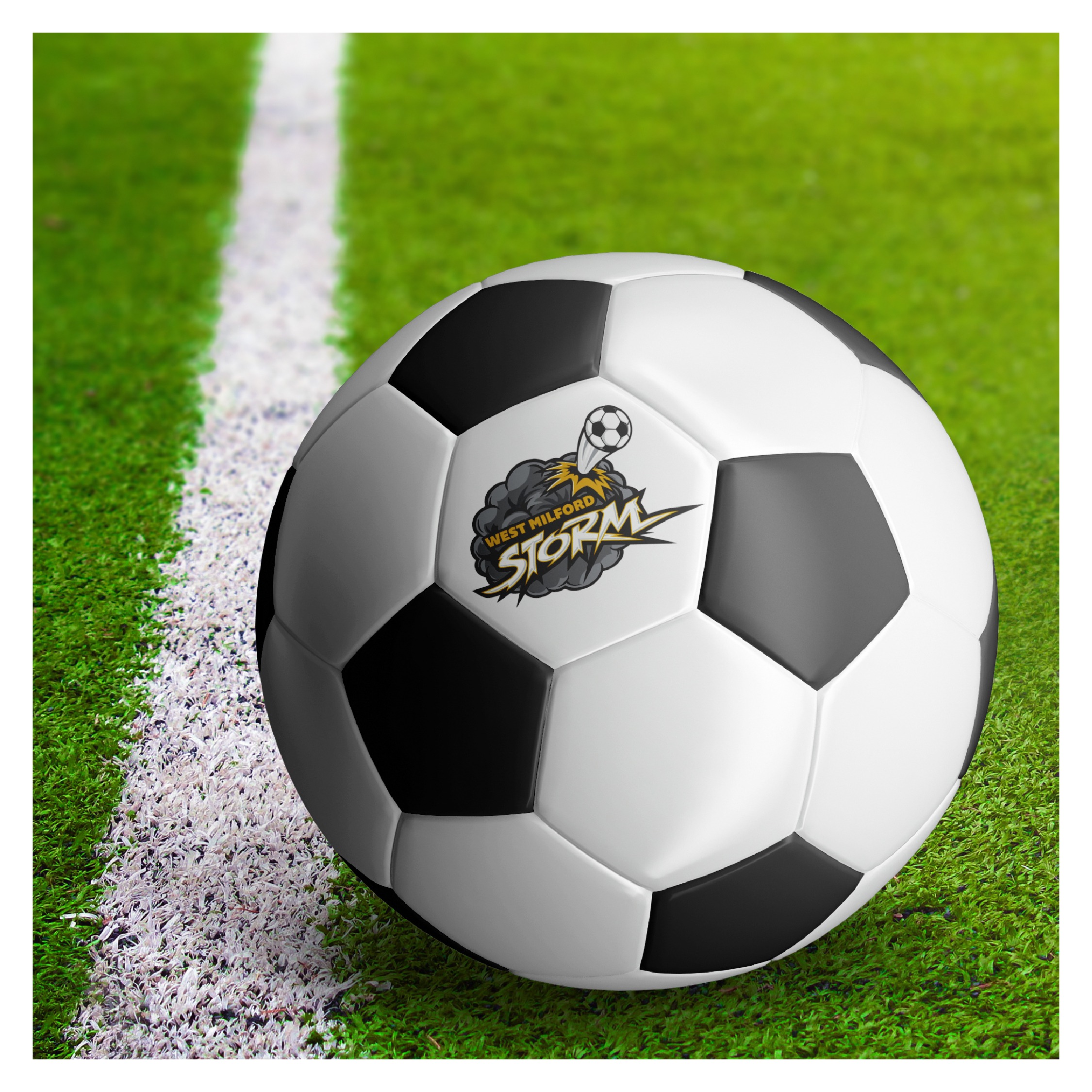
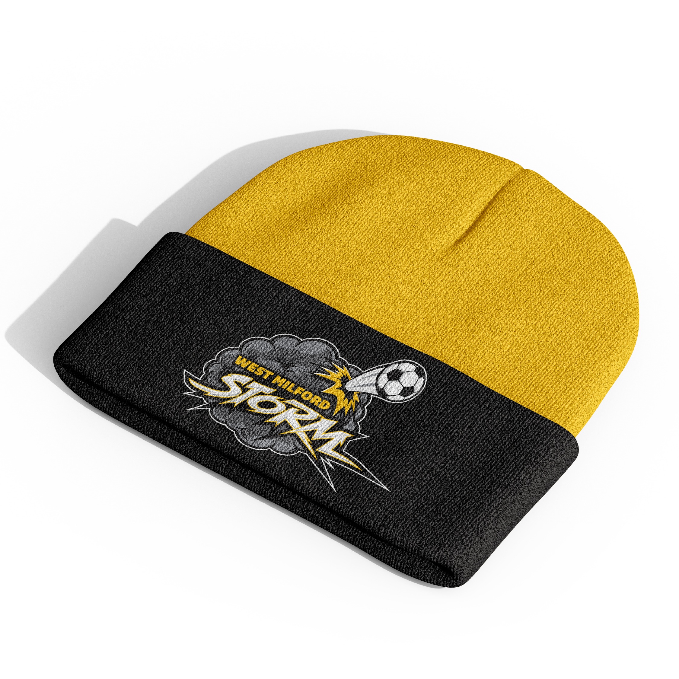
WEST MILFORD STORM:  logo

THE CROW EMPORIUM: logo+

STRASSBURGER: packaging

LARREA: menu+
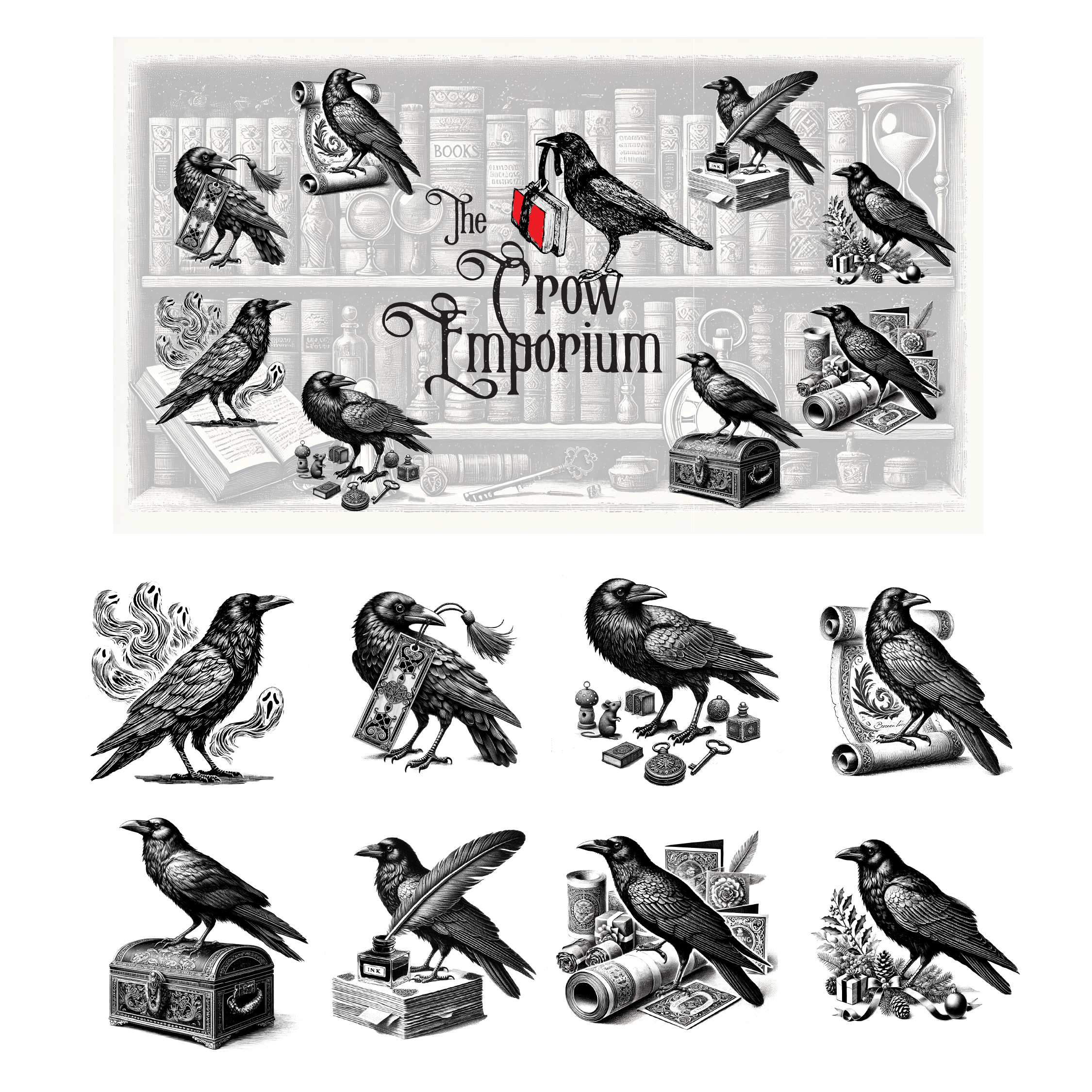
THE CROW EMPORIUM logo+

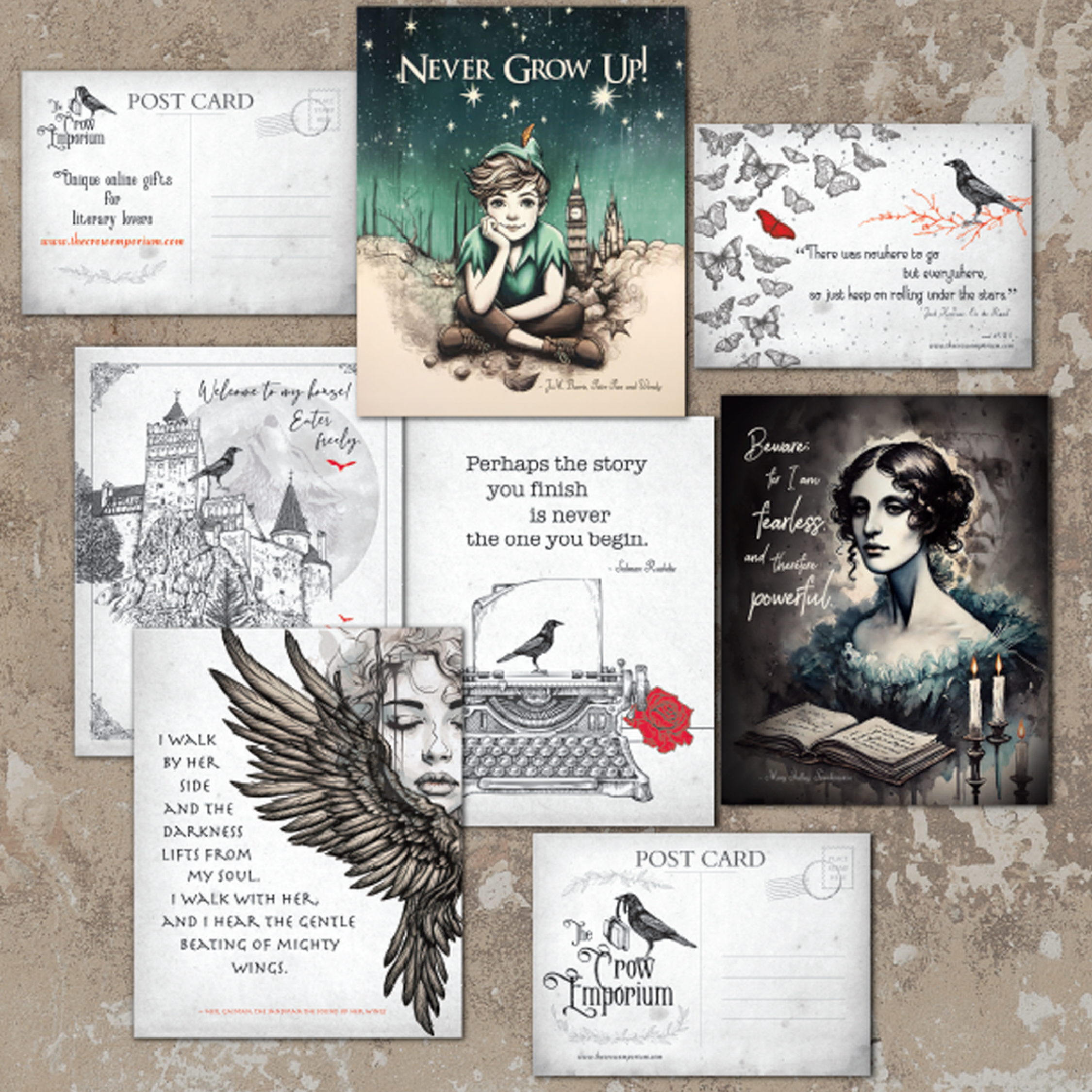
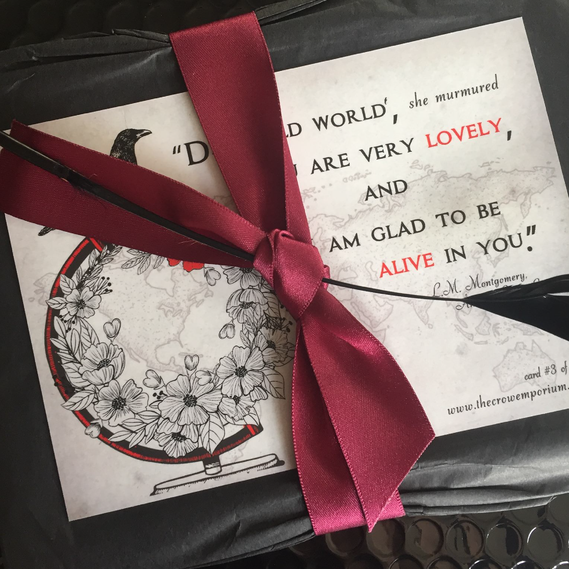
The Crow Emporium brand was brought to life through a distinctive logo and a full suite of supporting materials designed to celebrate the shop’s love of literature and darkly whimsical charm. The primary mark features a hand-illustrated crow carrying a crimson-edged book, paired with elegant Victorian-inspired typography that hints at mystery and storytelling. From signage and postcards to collectible prints, tote bags, and custom packaging, each piece carries the brand’s signature black-and-white palette with subtle pops of red, creating a cohesive look that feels both timeless and enchanting. 

LARREA menu+
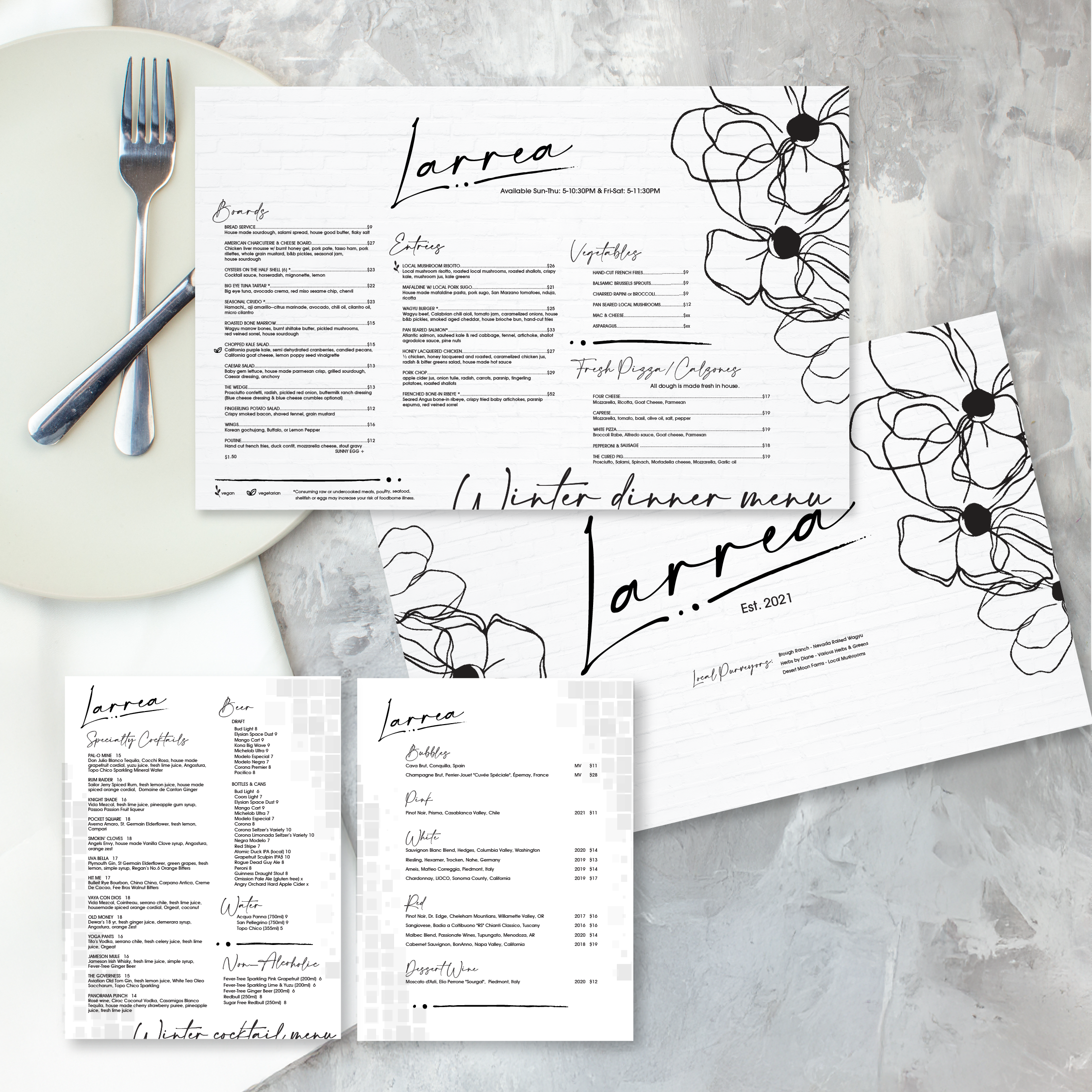
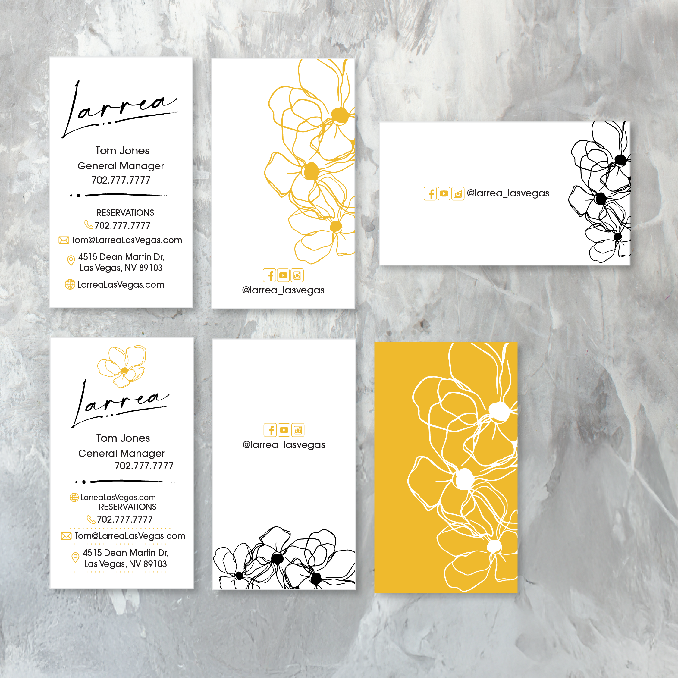
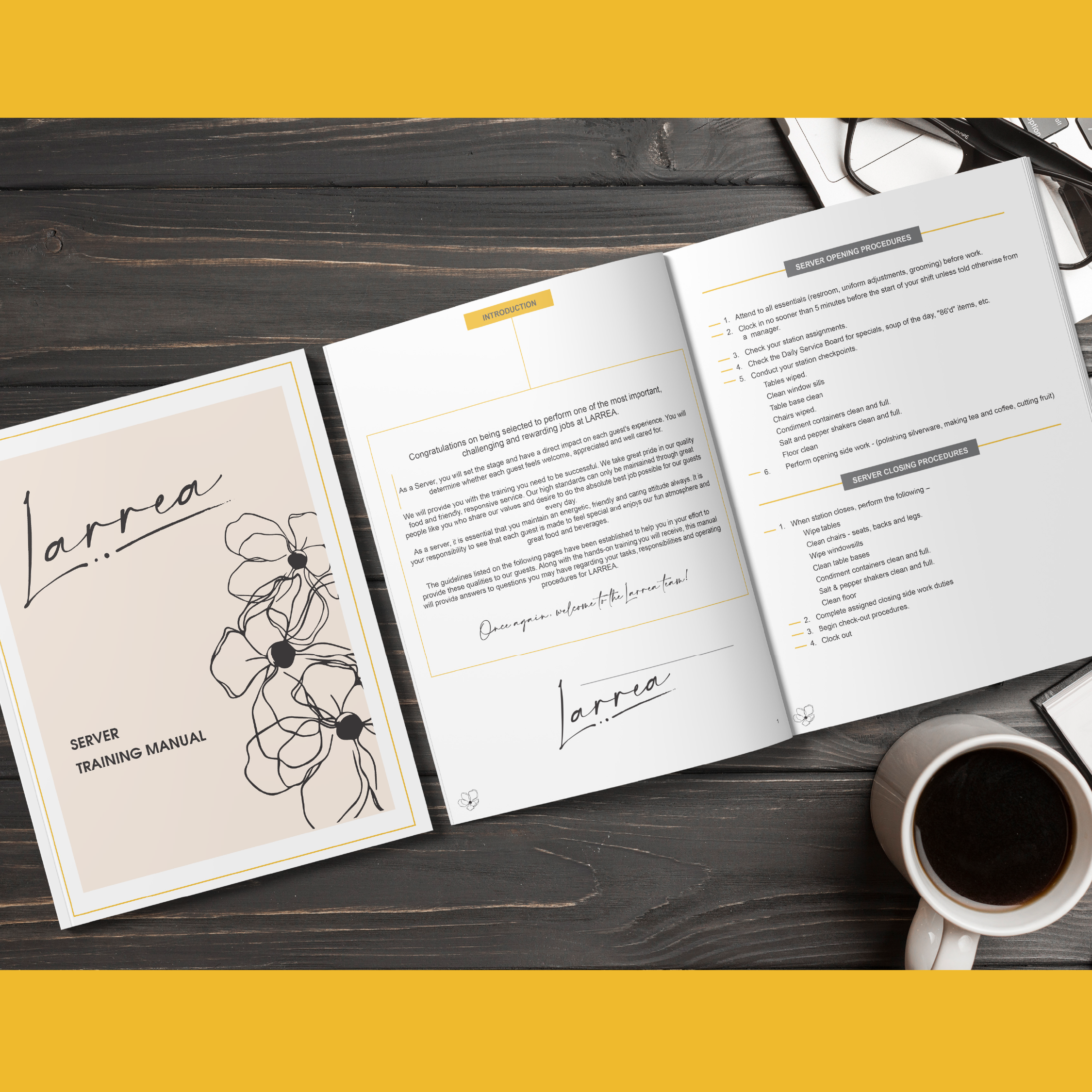
The Larrea brand identity captures modern elegance with a soft, botanical touch. The menus, business cards, and training materials feature clean white layouts accented by hand-drawn floral illustrations and sleek, handwritten typography. The combination of black, white, and a warm golden yellow creates a refined yet inviting look that ties every element—from dinner menus to staff manuals—into one cohesive, upscale visual language.

Larrea business cards
Larrea training manual design

HEATHER & OLIVE – logo & branding

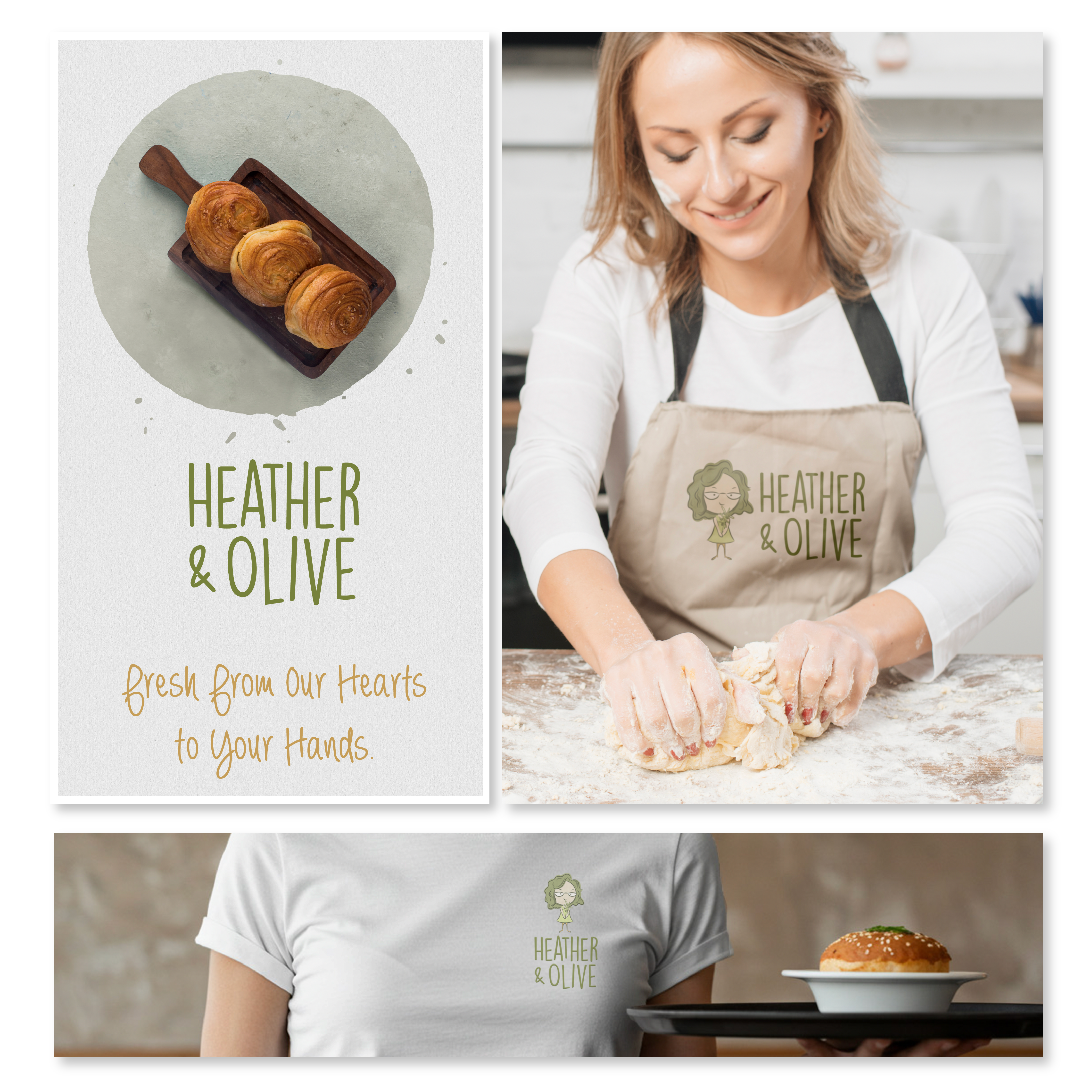
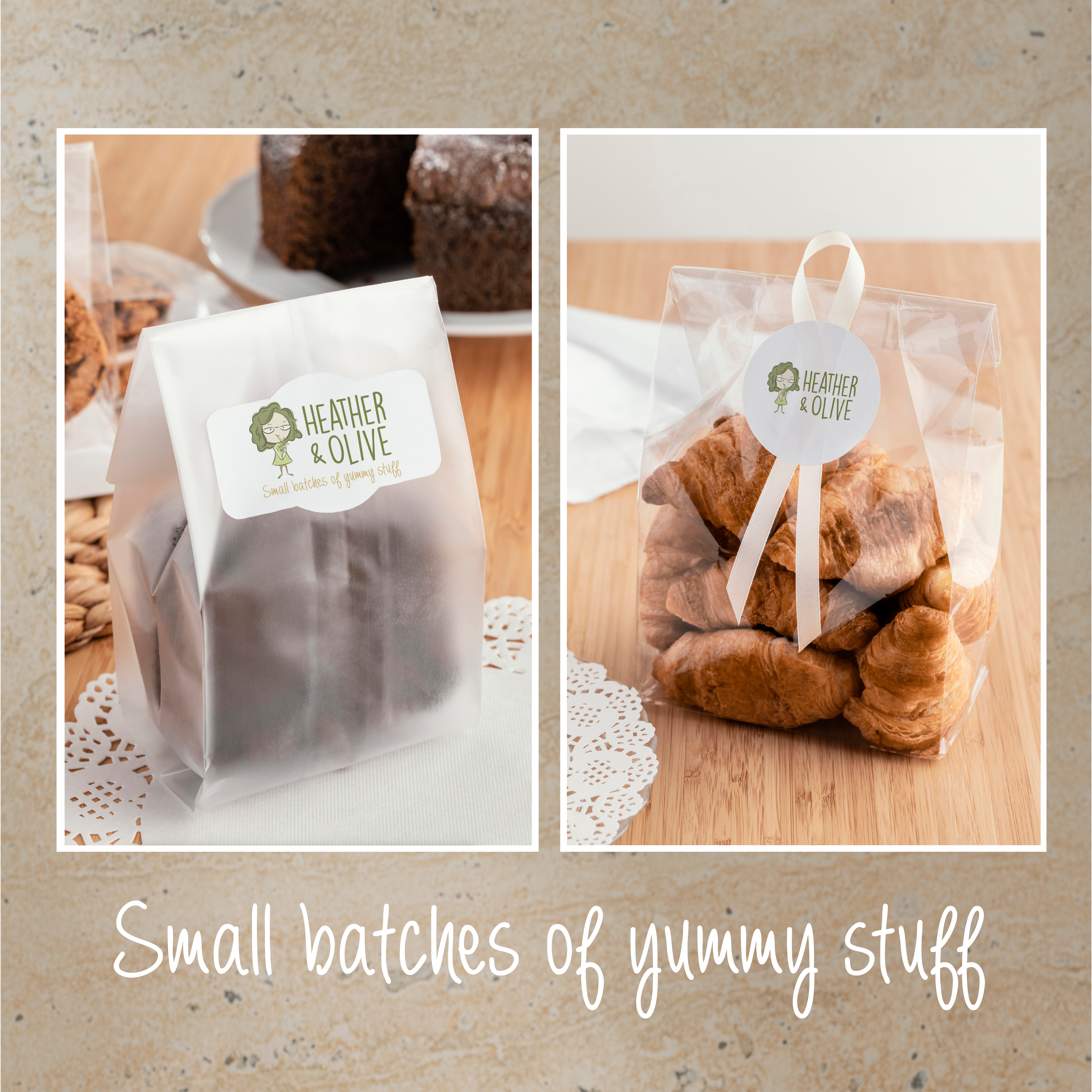
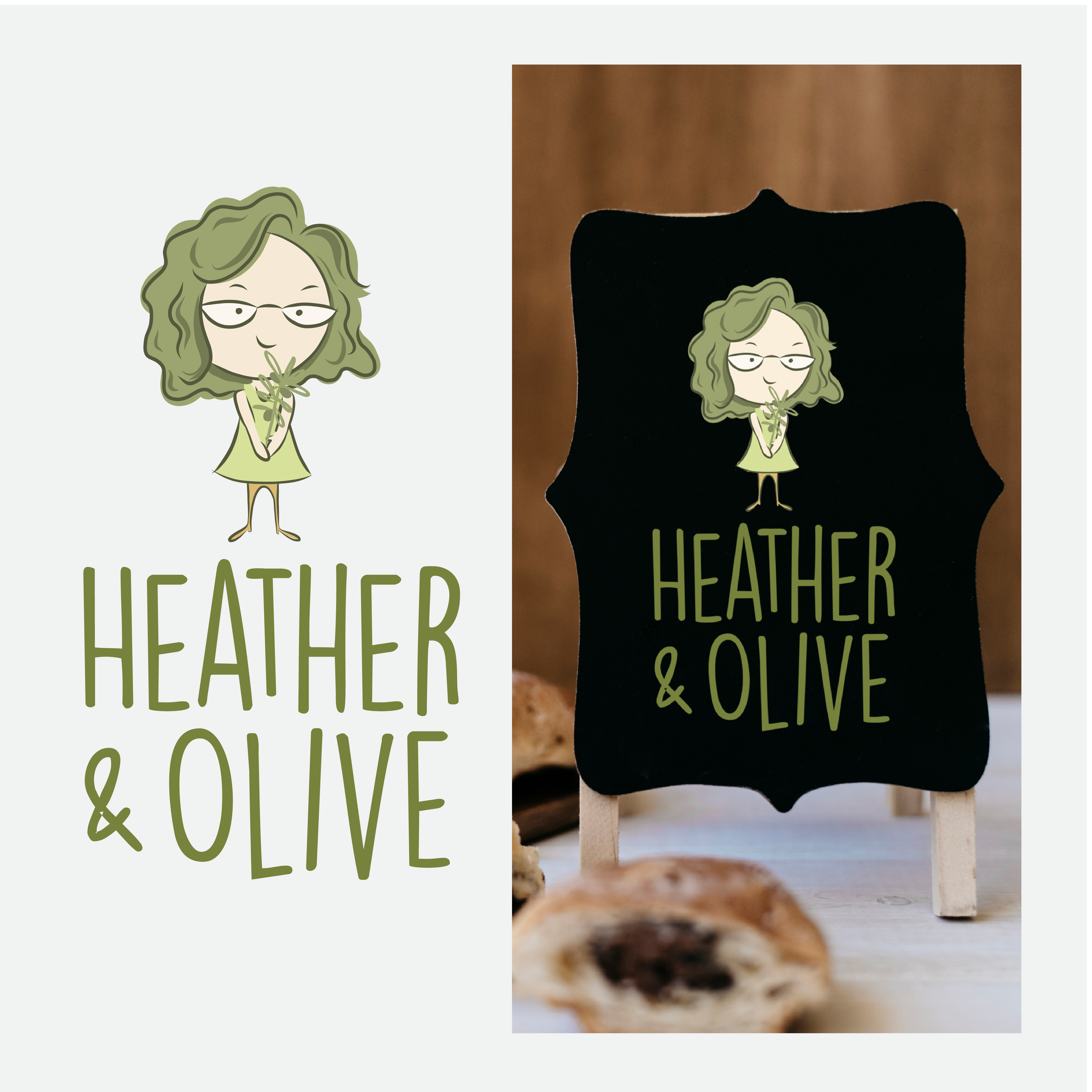
This cheerful brand identity captures the warmth and homemade charm of Heather & Olive’s small-batch treats. A playful illustrated character paired with hand-drawn typography and earthy olive and honey tones creates a welcoming, artisanal feel. From product packaging and stickers to apparel and signage, every element reinforces the message of handcrafted goodness—“small batches of yummy stuff” delivered with personality and heart.

Heather & Olive bakery labels
Heather & Olive logo and mini chalkboard sign

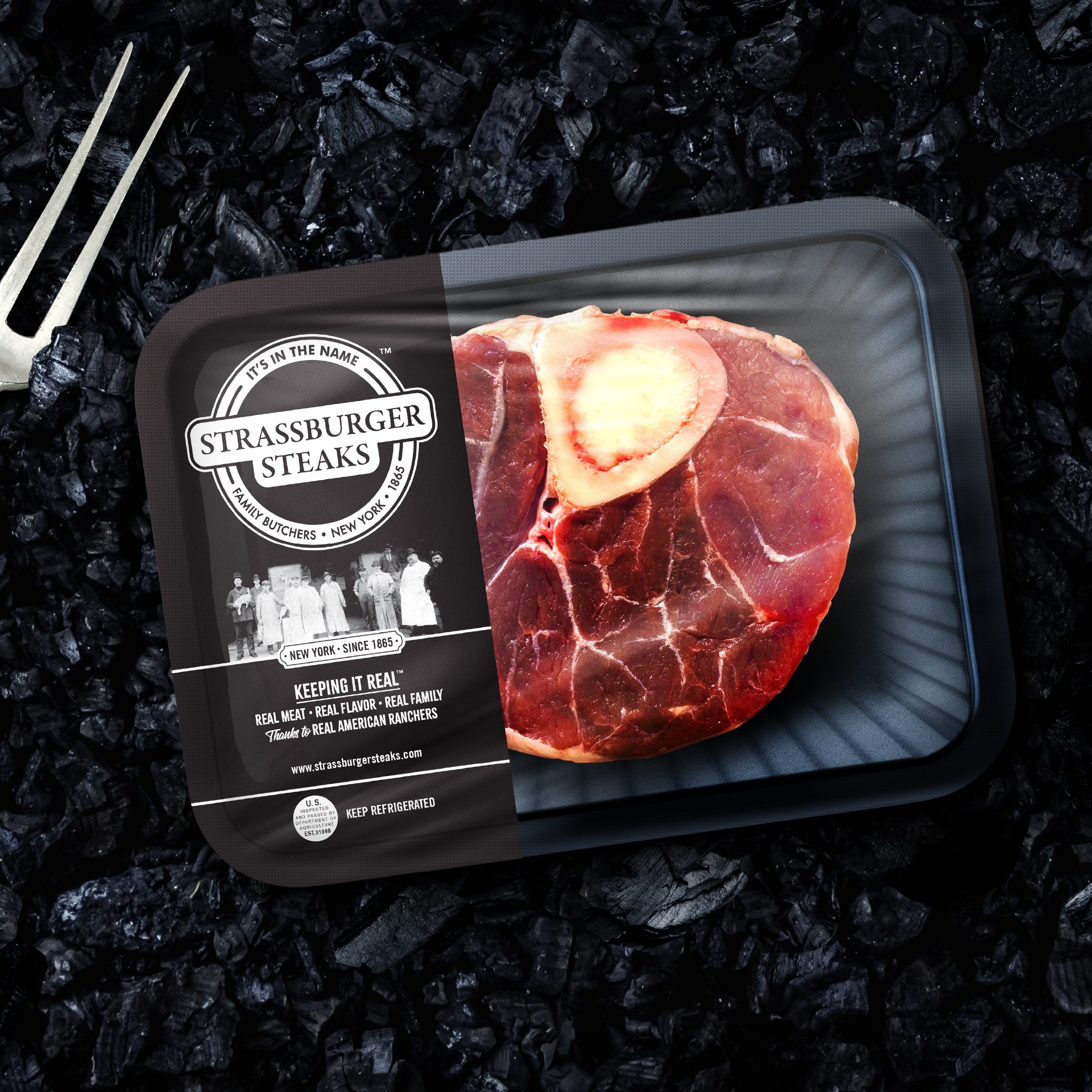
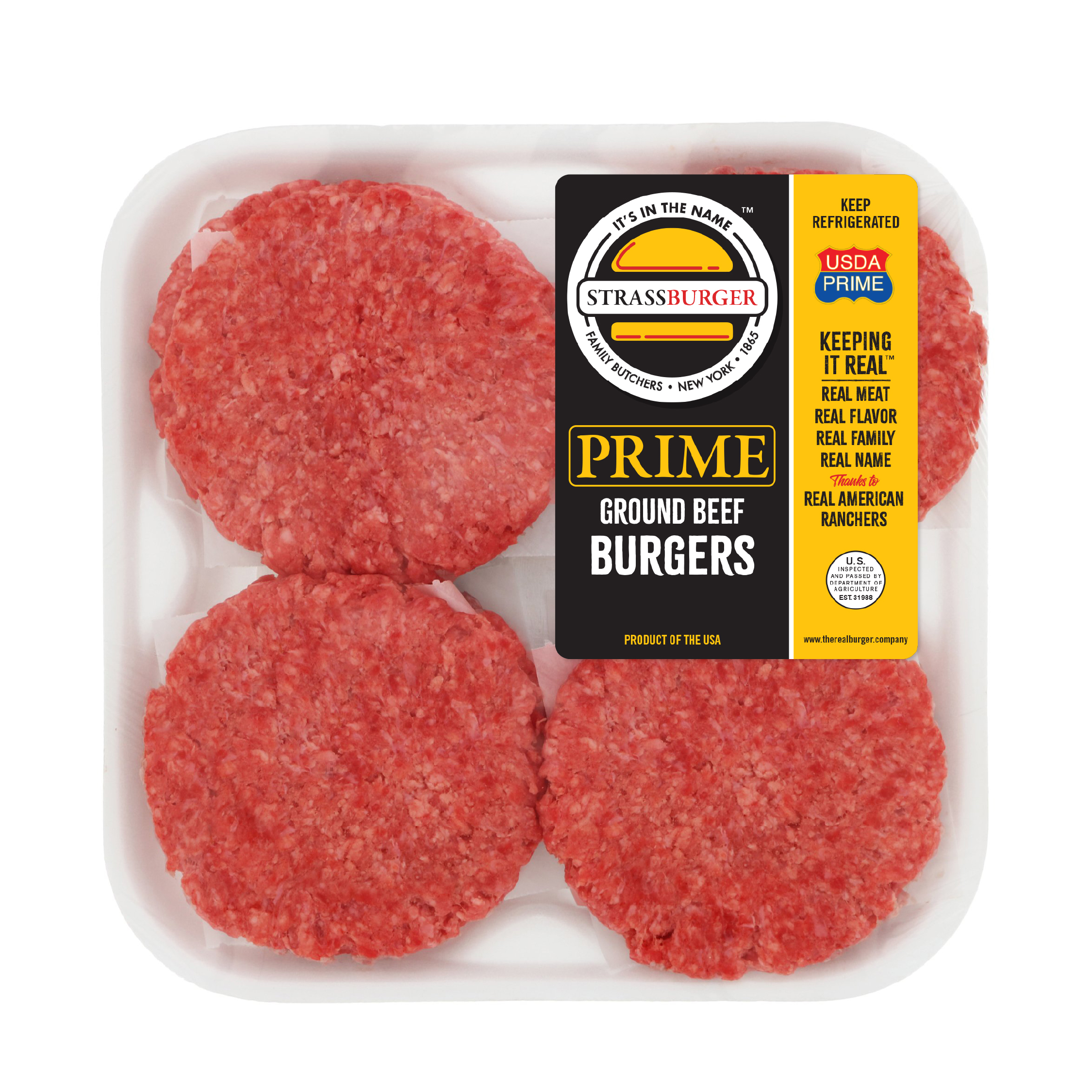
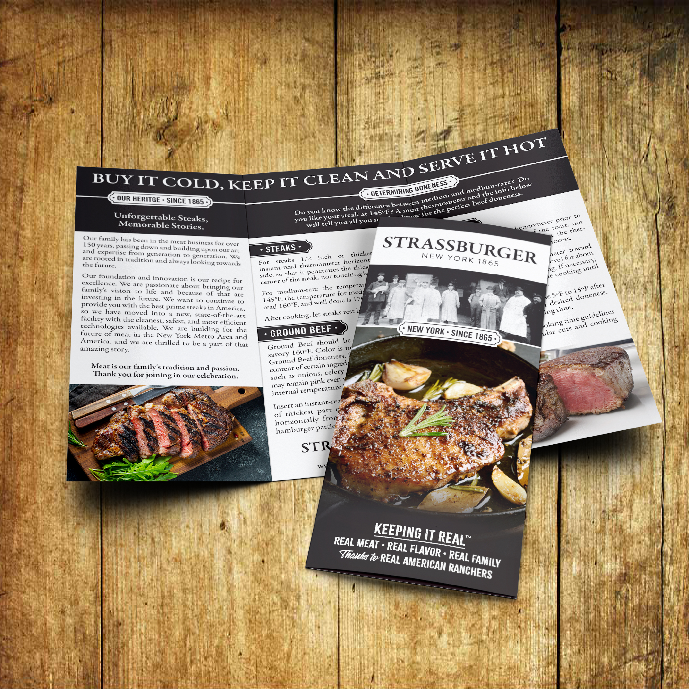
Strassburger – Packaging & Brand Design

For over 150 years, the Strassburger name has stood for real quality, real flavor, and real family tradition. This packaging system was designed to honor that heritage while bringing a bold, modern edge to today’s market. The iconic round logo anchors every touchpoint, paired with strong typography, striking food photography, and messaging that reinforces the brand promise: “Keeping It Real Since 1865.”

From retail-ready ground beef packs to premium steak boxes and promotional flyers, the design system communicates trust, authenticity, and craftsmanship. It balances tradition with contemporary appeal—making every product look as good on the shelf as it tastes on the plate.

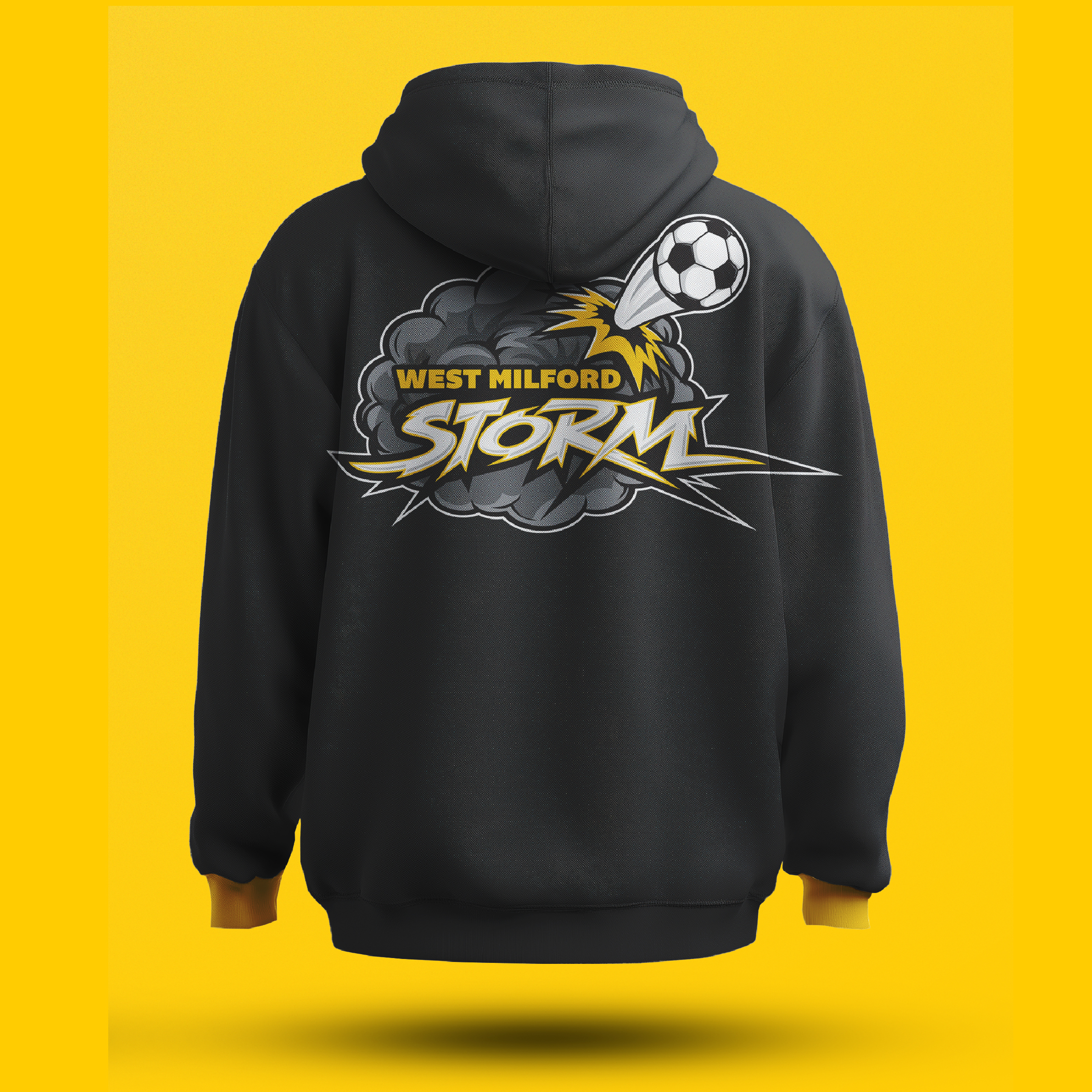
West Milford Storm – Youth Soccer Logo

This energetic logo was created to capture the excitement and power of the West Milford Storm kids’ soccer team. A bold, lightning-charged storm cloud bursts with motion as a soccer ball rockets forward, symbolizing speed, teamwork, and unstoppable energy. The dynamic typography, paired with a striking yellow and charcoal color palette, gives the mark a professional yet playful feel—perfect for inspiring young athletes and uniting fans on and off the field.

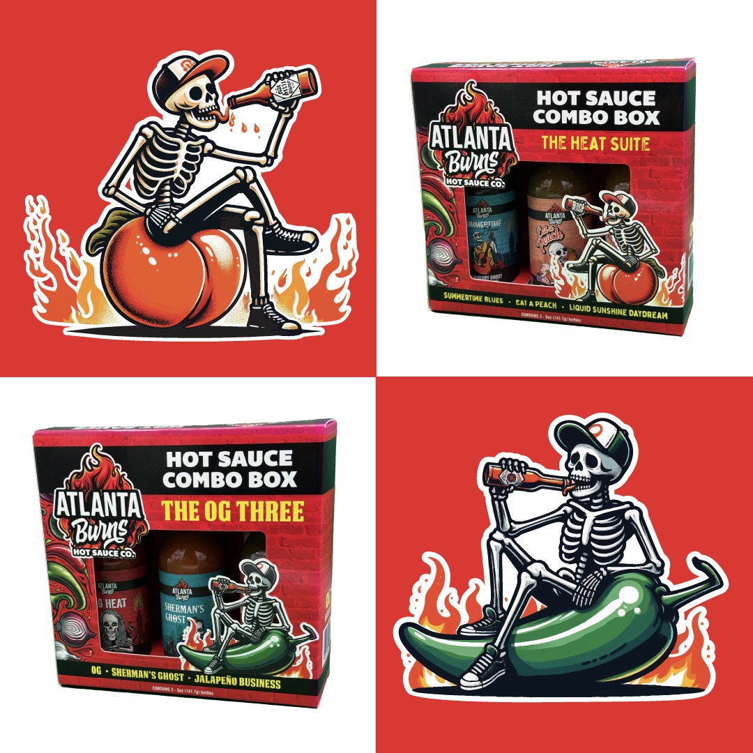
ATLANTA BURNS HOT SAUCE CO - logo & packaging 

The Atlanta Burns Hot Sauce Co. brand ignites with a fiery identity that matches the heat of its products. The logo erupts in vibrant flame illustrations layered behind punchy typography, instantly signaling intensity and flavor. Extending the brand across packaging, a cast of playful skeleton mascots brings attitude and humor to each product—whether perched on a pepper or sipping sauce straight from the bottle. Custom combo-box packaging features dynamic illustrations, textured brick backdrops, and eye-catching color palettes that pop on shelves and online.

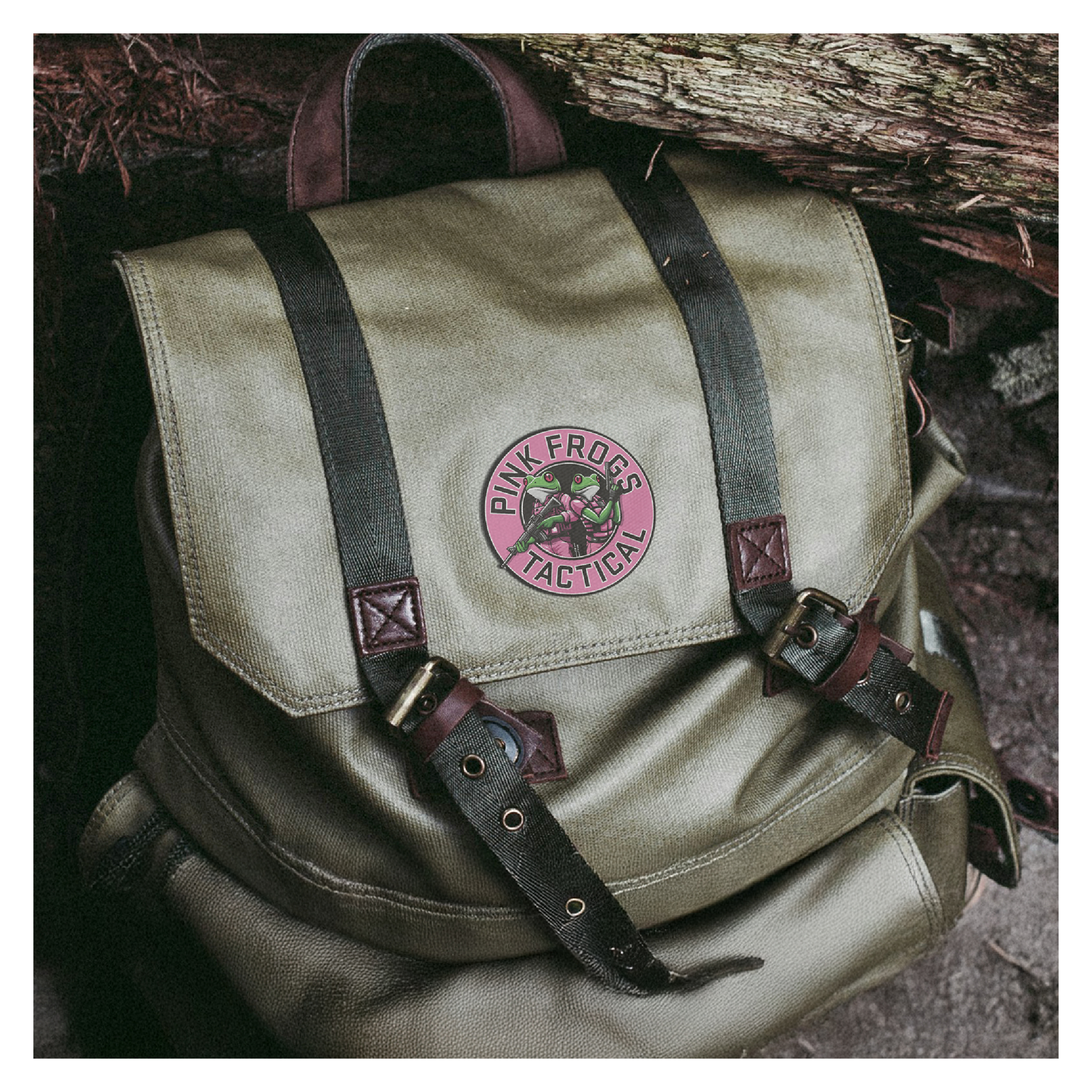
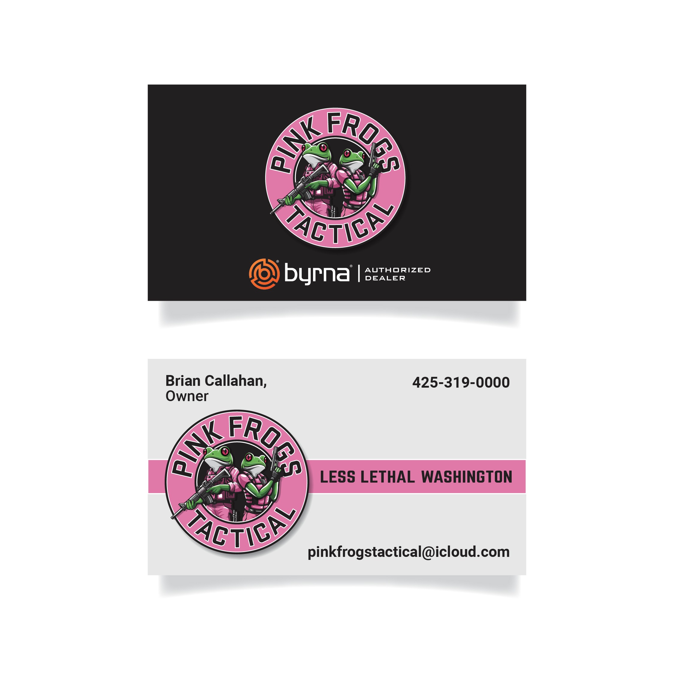
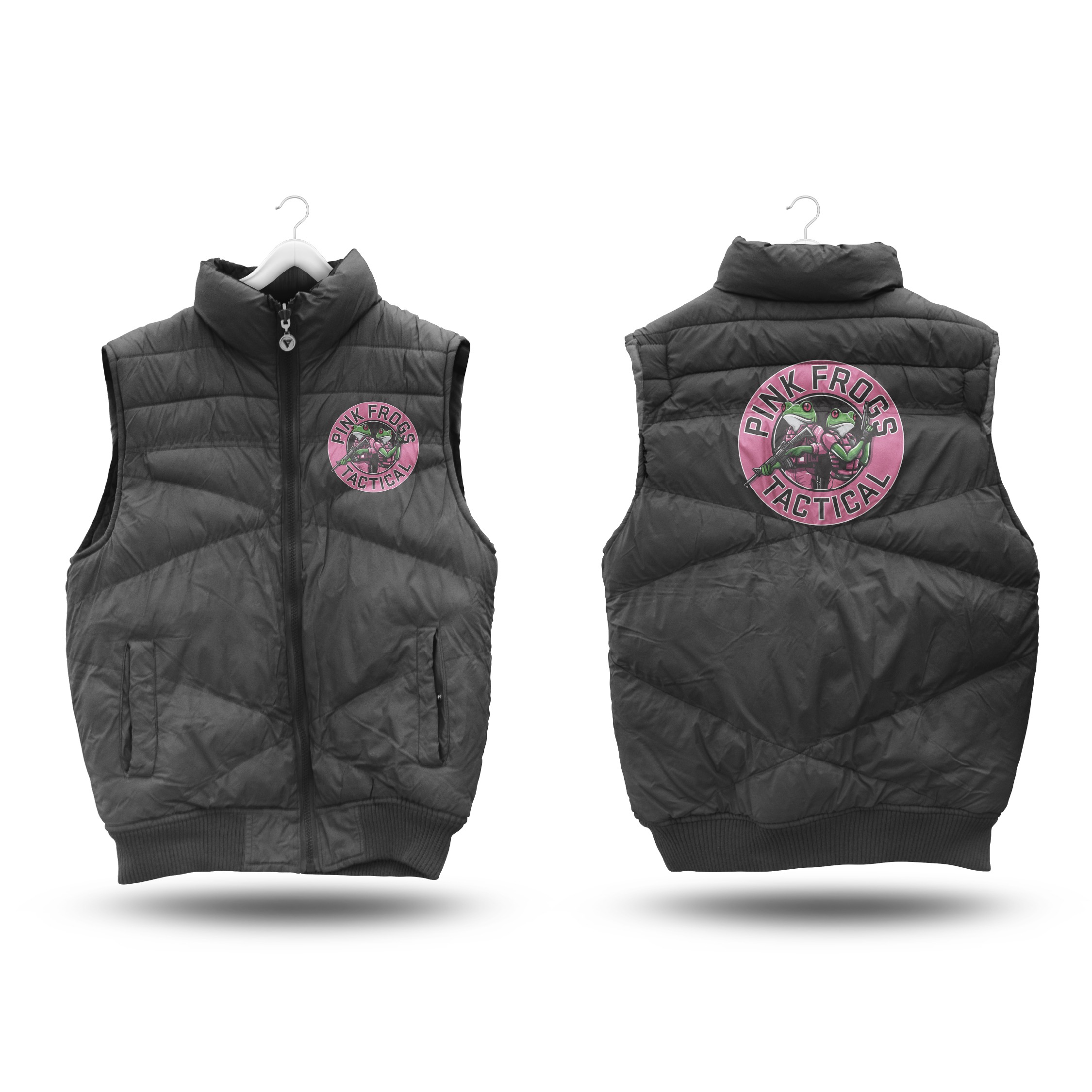
Pink Frogs Tactical – Logo & Brand Design

The Pink Frogs Tactical identity combines unexpected humor with a tough, tactical edge. At the center of the brand are two strikingly illustrated green frogs, geared up in full tactical equipment and decked out in vivid pink—an attention-grabbing twist that perfectly embodies the company’s fearless personality.

The circular badge logo pairs sharp, military-inspired typography with high-contrast color blocking, creating a mark that’s instantly recognizable on business cards, apparel, and gear. From embroidered vests and rugged patches to business stationery and outdoor applications, the design carries a rebellious confidence that sets the brand apart while staying clean, professional, and ready for action.

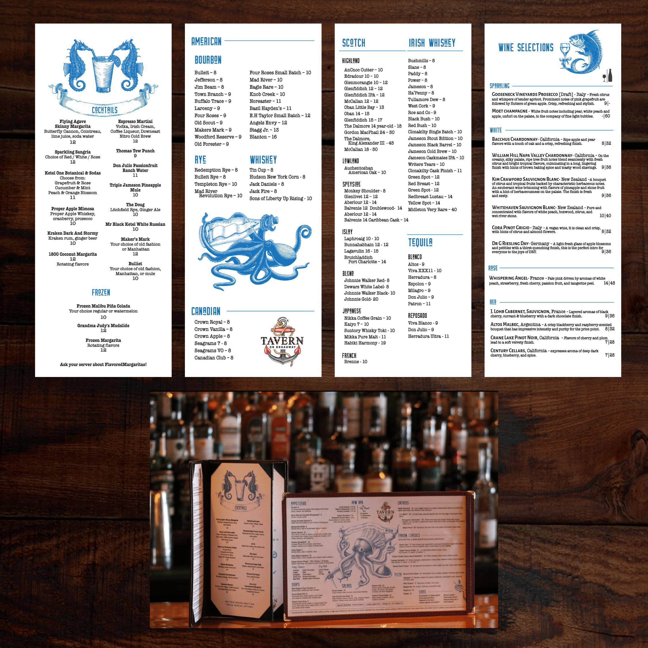
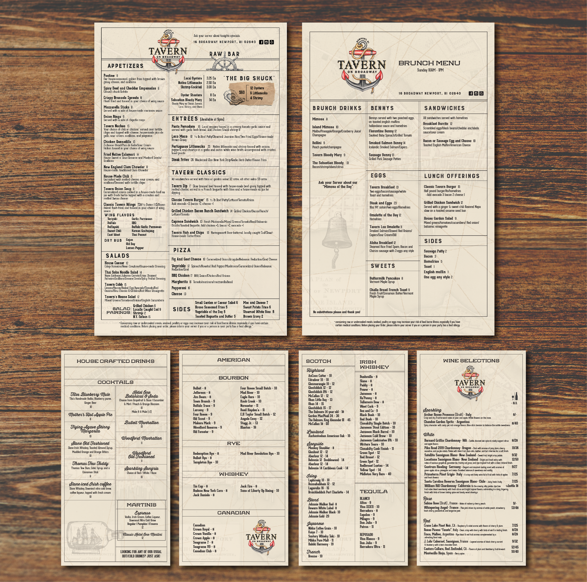
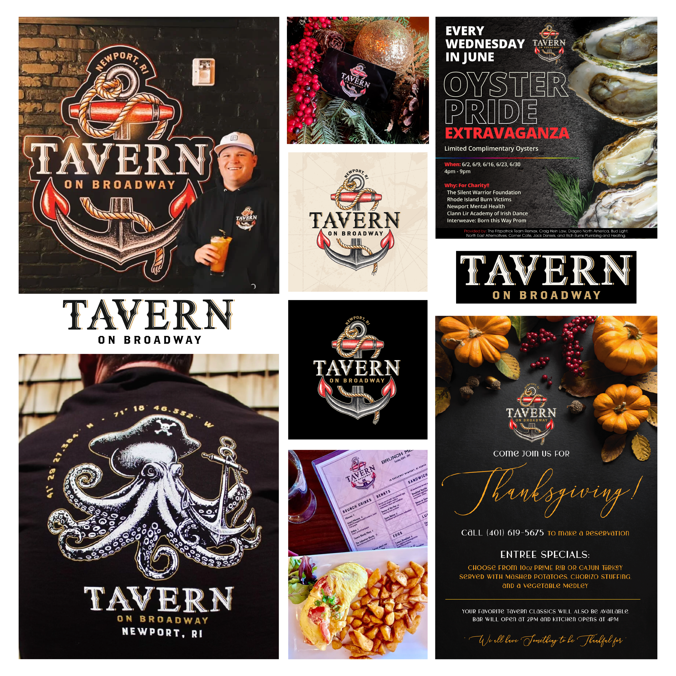
Tavern on Broadway – Logo & Menu Design

The Tavern on Broadway brand centers on a strong nautical logo that pairs a classic anchor with crisp typography, creating an emblem as memorable as the restaurant itself. That maritime identity flows into the menu system, where clean layouts and detailed blue sea-life illustrations add handcrafted character to food and drink lists. Even the black-and-red storefront was designed to echo the logo’s bold lines and timeless style, tying the exterior, menus, and overall brand into one cohesive coastal experience.

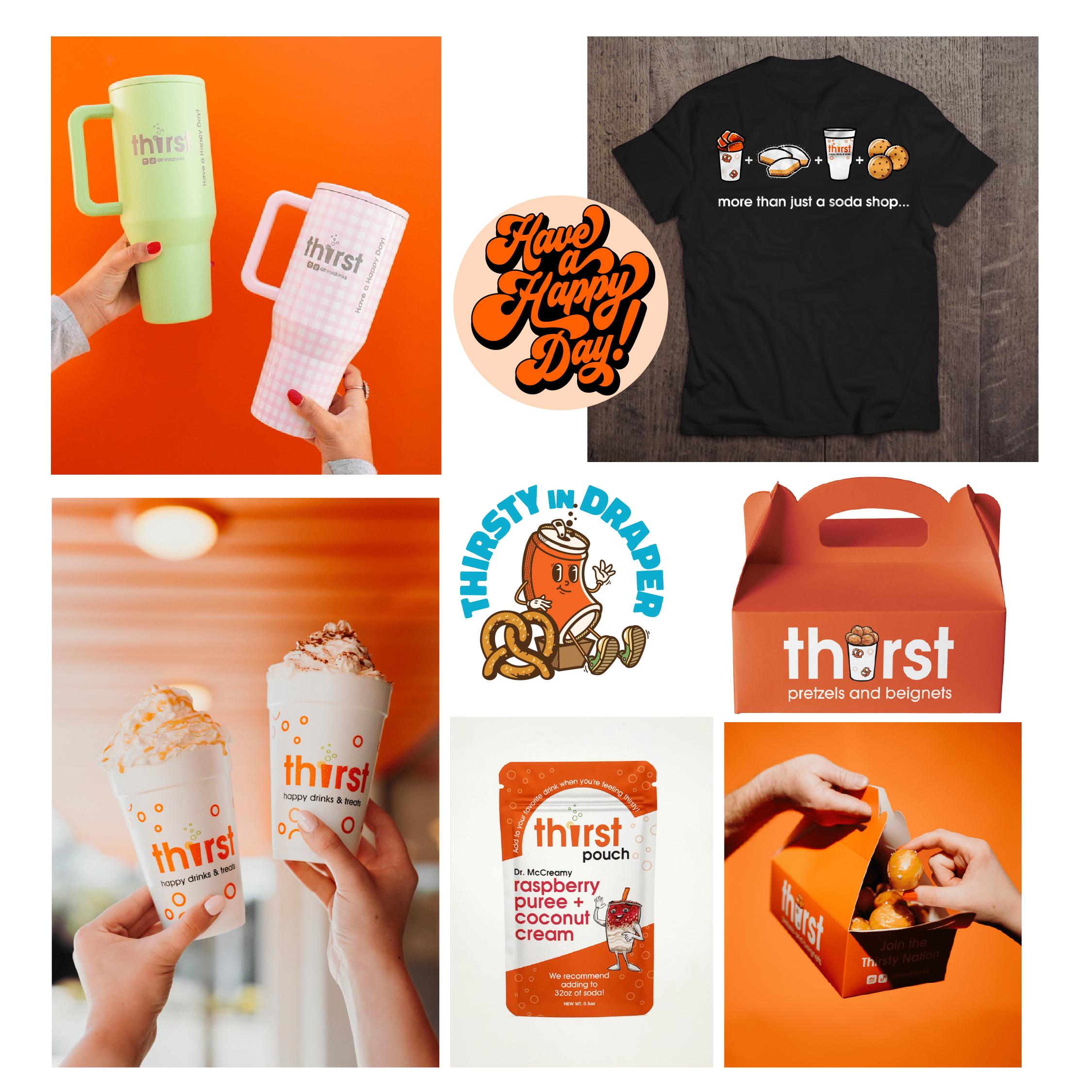
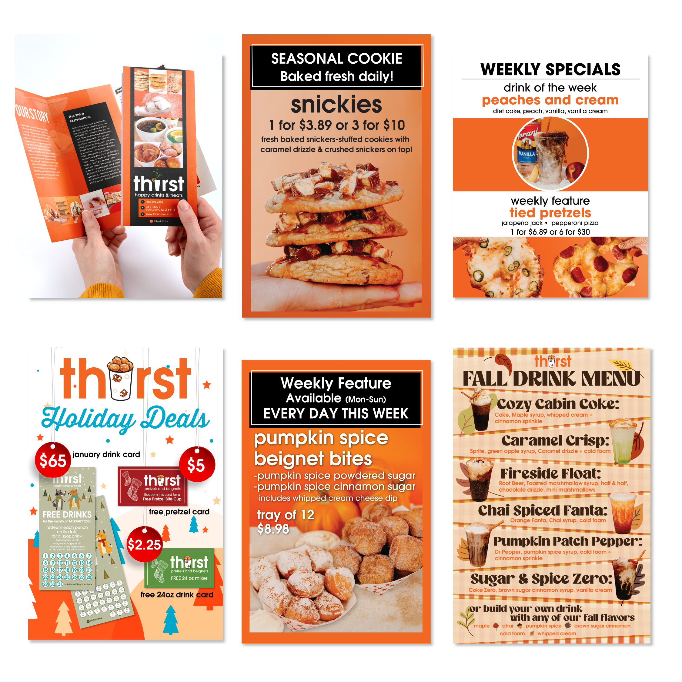
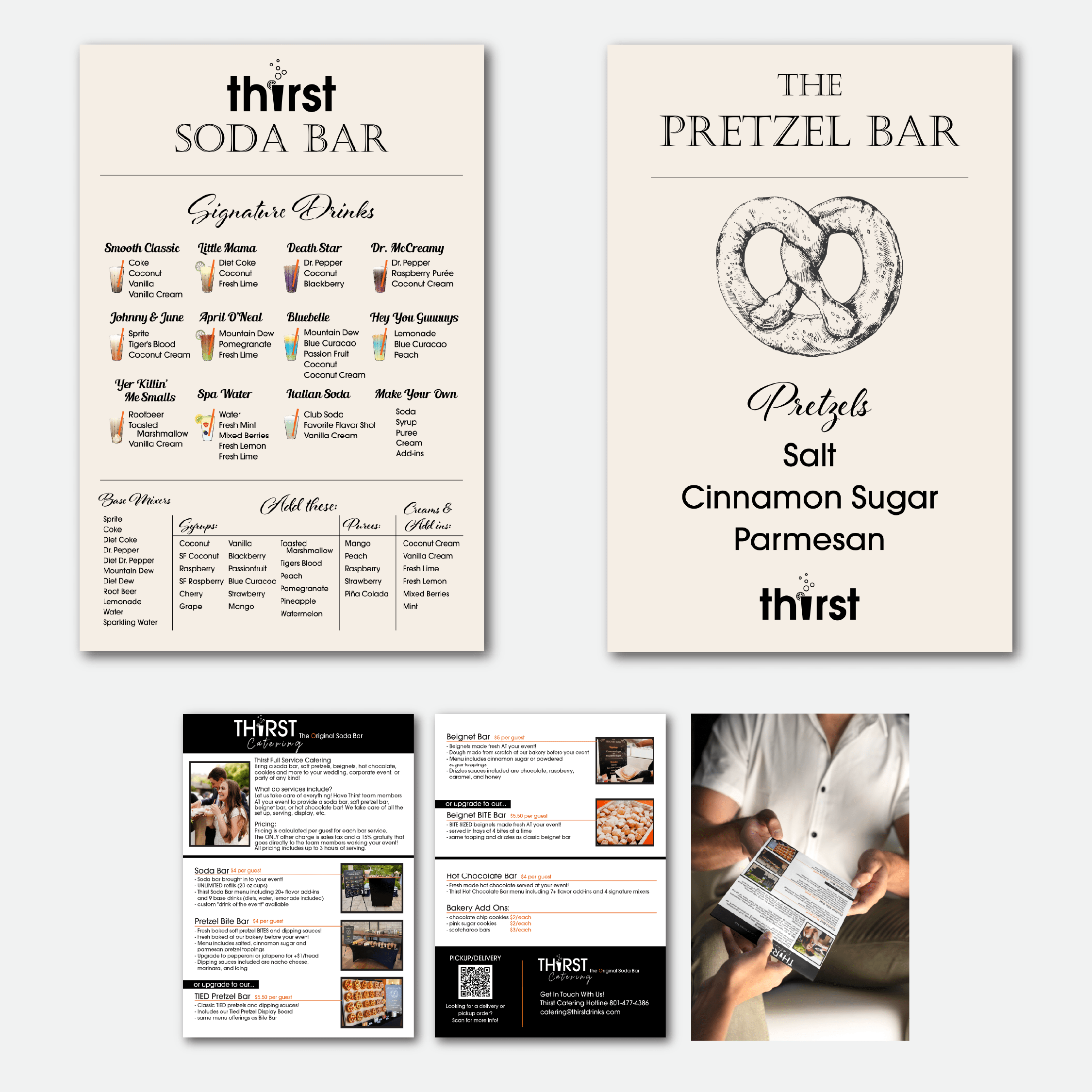
THIRST DRINKS

The Thirst brand refresh modernized a beloved pretzel-and-beignet shop with a bold new look and a versatile suite of supporting materials. The updated logo swaps flat typography for a playful cup illustration brimming with pretzel bites, instantly signaling the brand’s fun, craveable offerings. A vibrant orange-and-white palette unifies everything from drink cups and packaging to menus, seasonal promotions, and apparel. Custom icons, whimsical character graphics, and clean menu layouts create a cohesive system that feels fresh and energetic

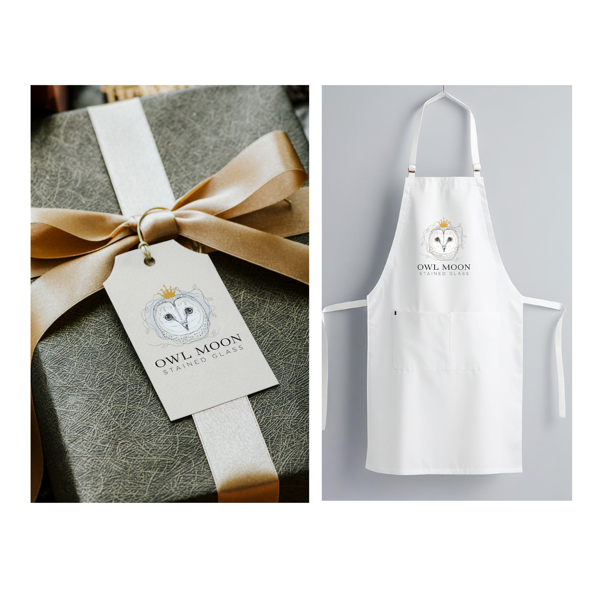
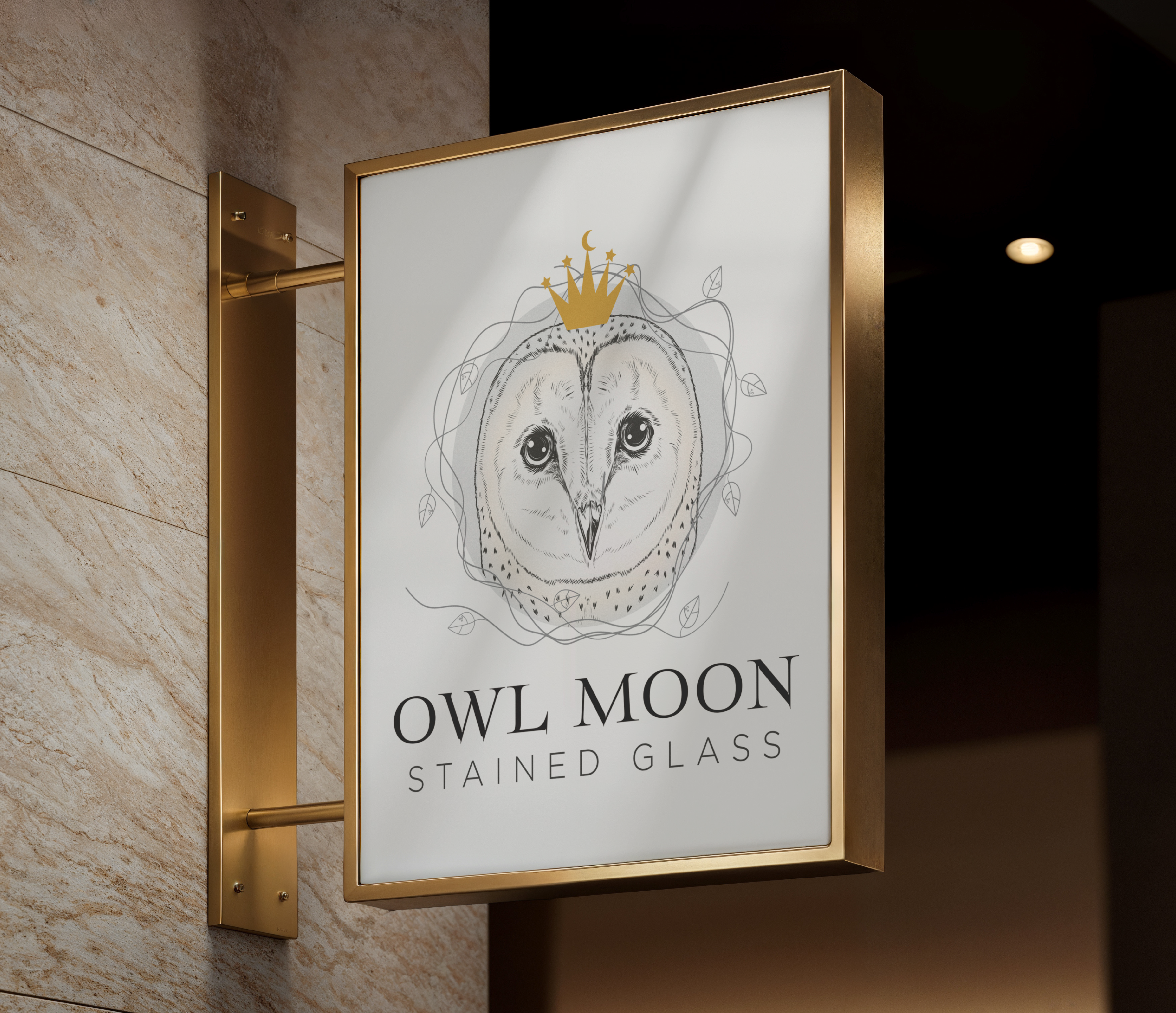
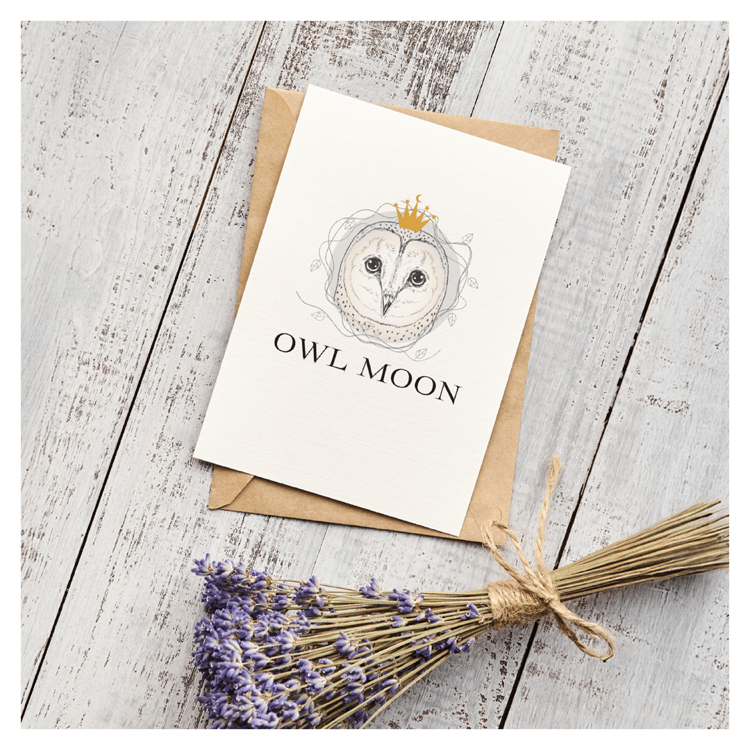
Owl Moon Stained Glass – Logo

The Owl Moon identity blends elegance and quiet strength, reflecting the artistry of hand-crafted stained glass. At its heart is a delicately illustrated barn owl, its gaze serene and inviting, encircled by a subtle vine motif that hints at natural growth and organic creativity. A golden crown—adorned with a crescent moon and tiny stars—adds a touch of magic and sophistication, symbolizing the luminous beauty of glass catching moonlight.

Paired with a clean, modern serif wordmark, the logo balances refined linework with a sense of wonder, making it equally striking on signage, packaging, and stationery. From gift tags and aprons to shop signage, the design elevates every customer touchpoint with an artisanal, timeless charm.

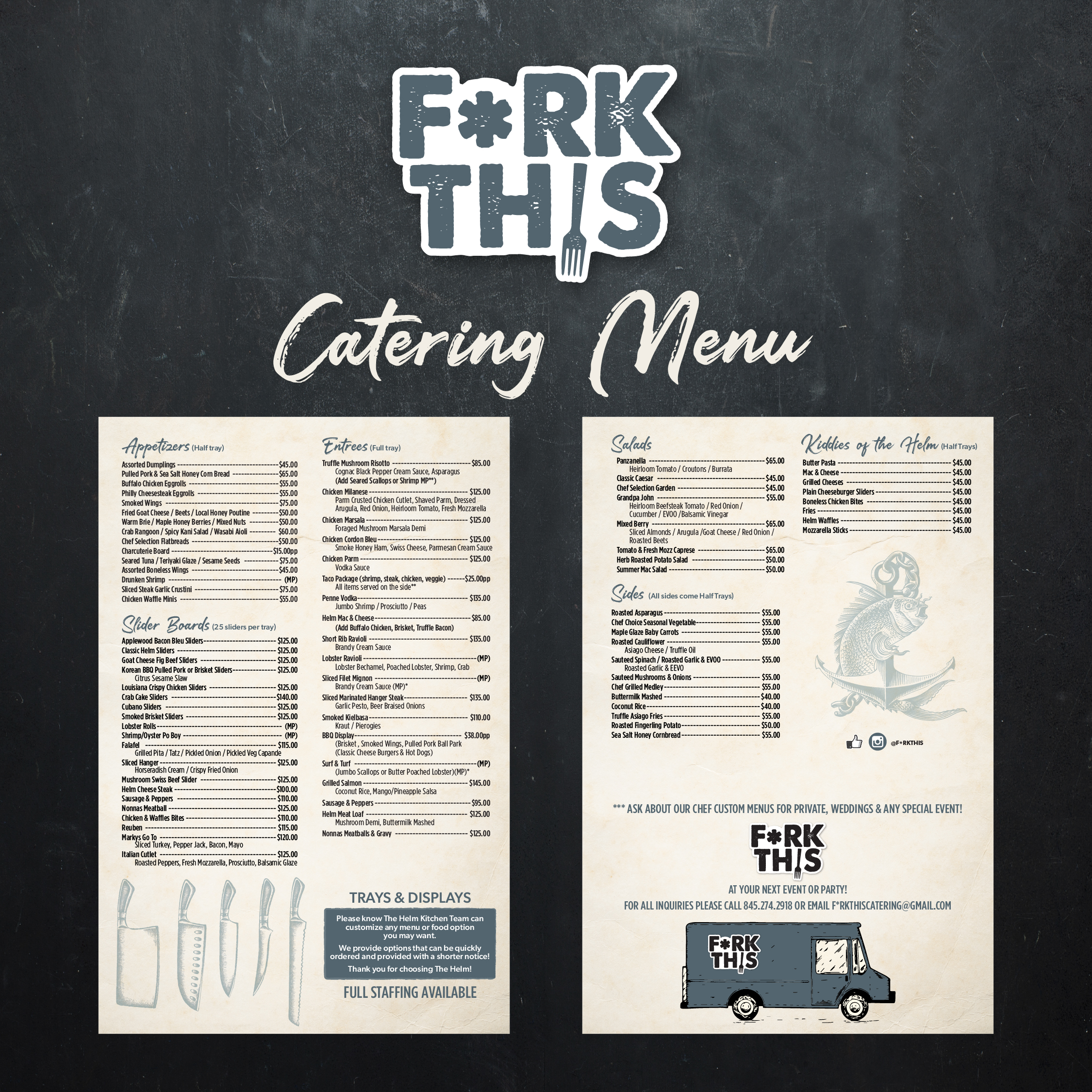
FORK THIS – Food Truck & Catering Brand Design

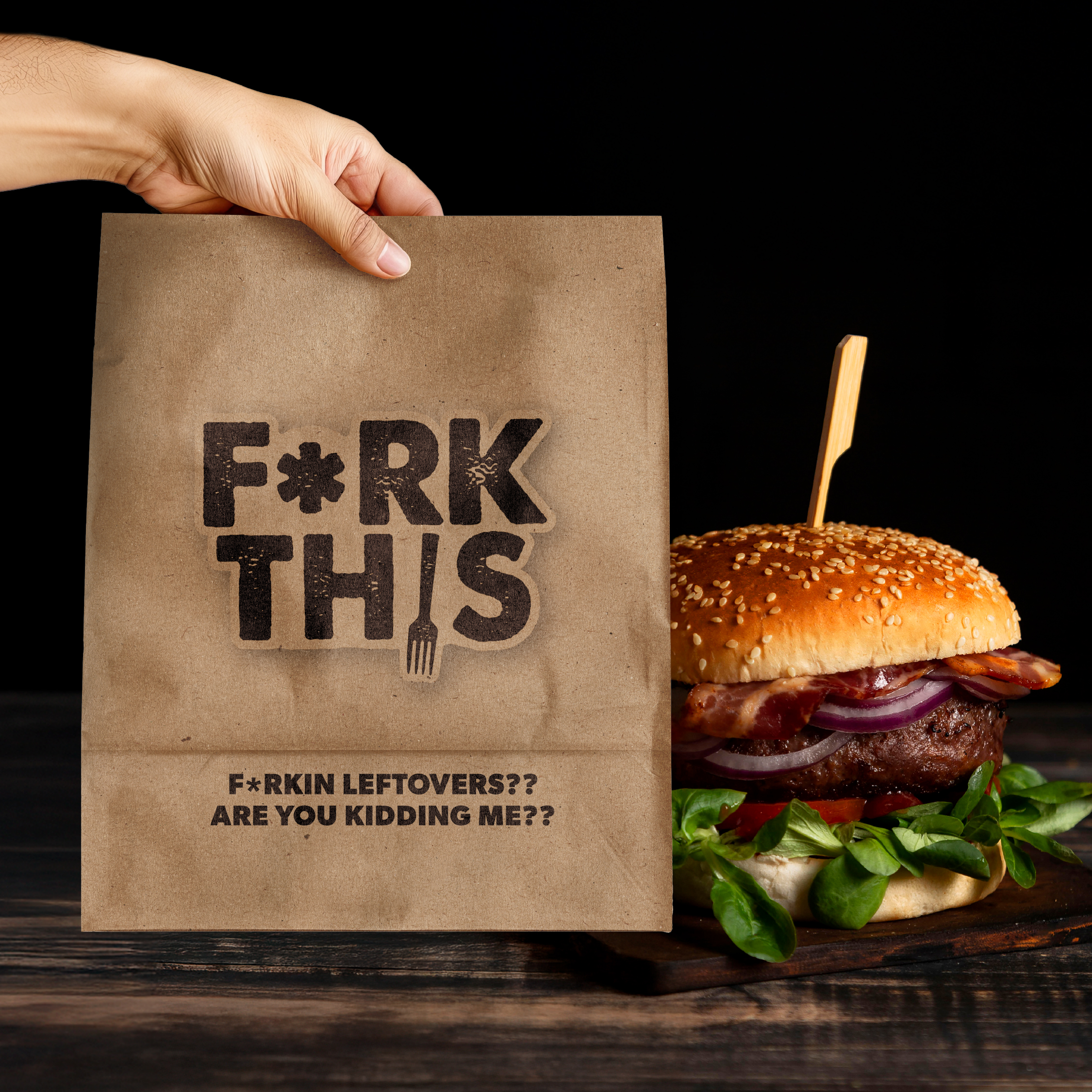
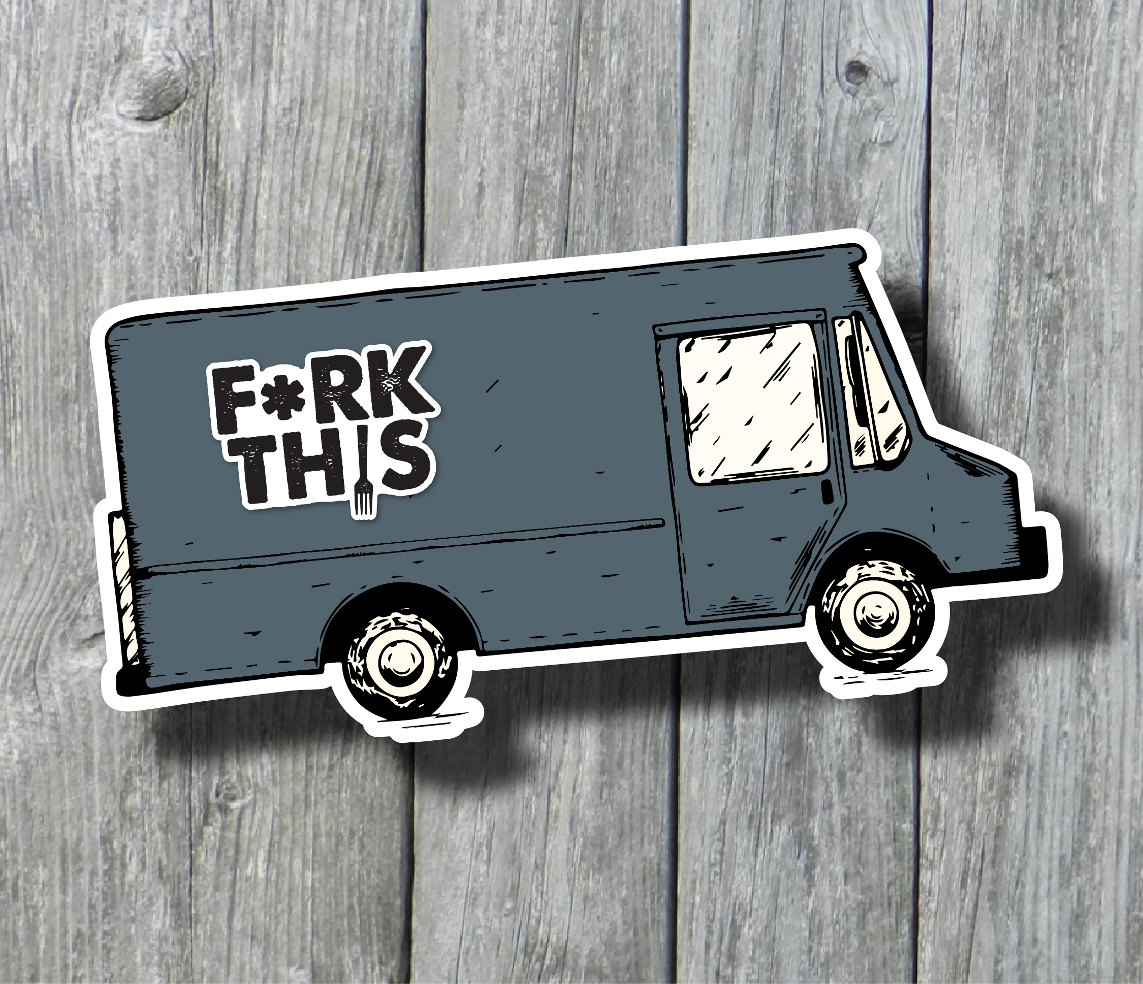
Bold, cheeky, and impossible to ignore, the FORK THIS brand identity was crafted to capture the food truck’s playful attitude and unforgettable flavor. The logo’s gritty, block-style typography—complete with a fork cleverly embedded in the lettering—immediately sets the tone: this is food so good you won’t want to share a single bite.

The design system carries that energy across every touchpoint, from catering menus and packaging to food truck graphics and merchandise. Rustic kraft paper boxes and bags reinforce the handcrafted quality of the menu, while the witty tagline (“Forkin’ leftovers?? Are you kidding me??”) invites customers to dive in. Together, the logo and menu design create a cohesive, street-smart brand that’s as bold and satisfying as the food itself.

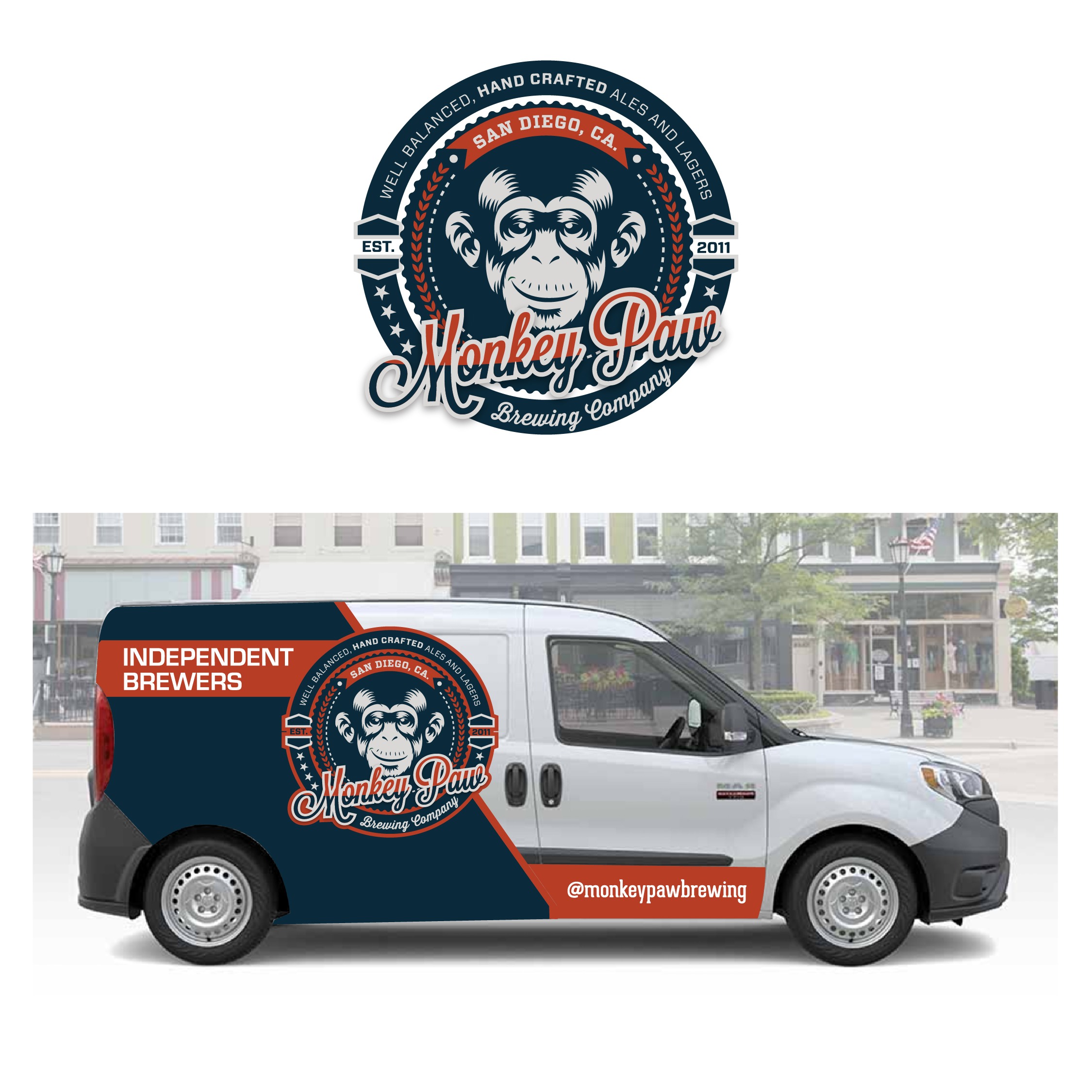
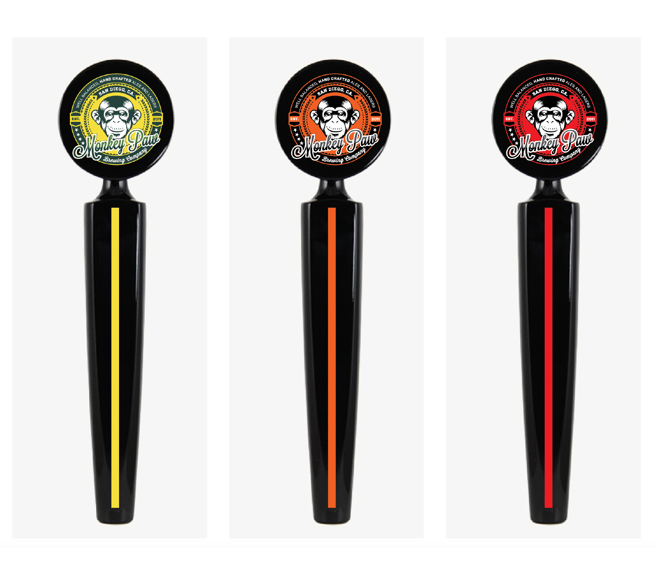
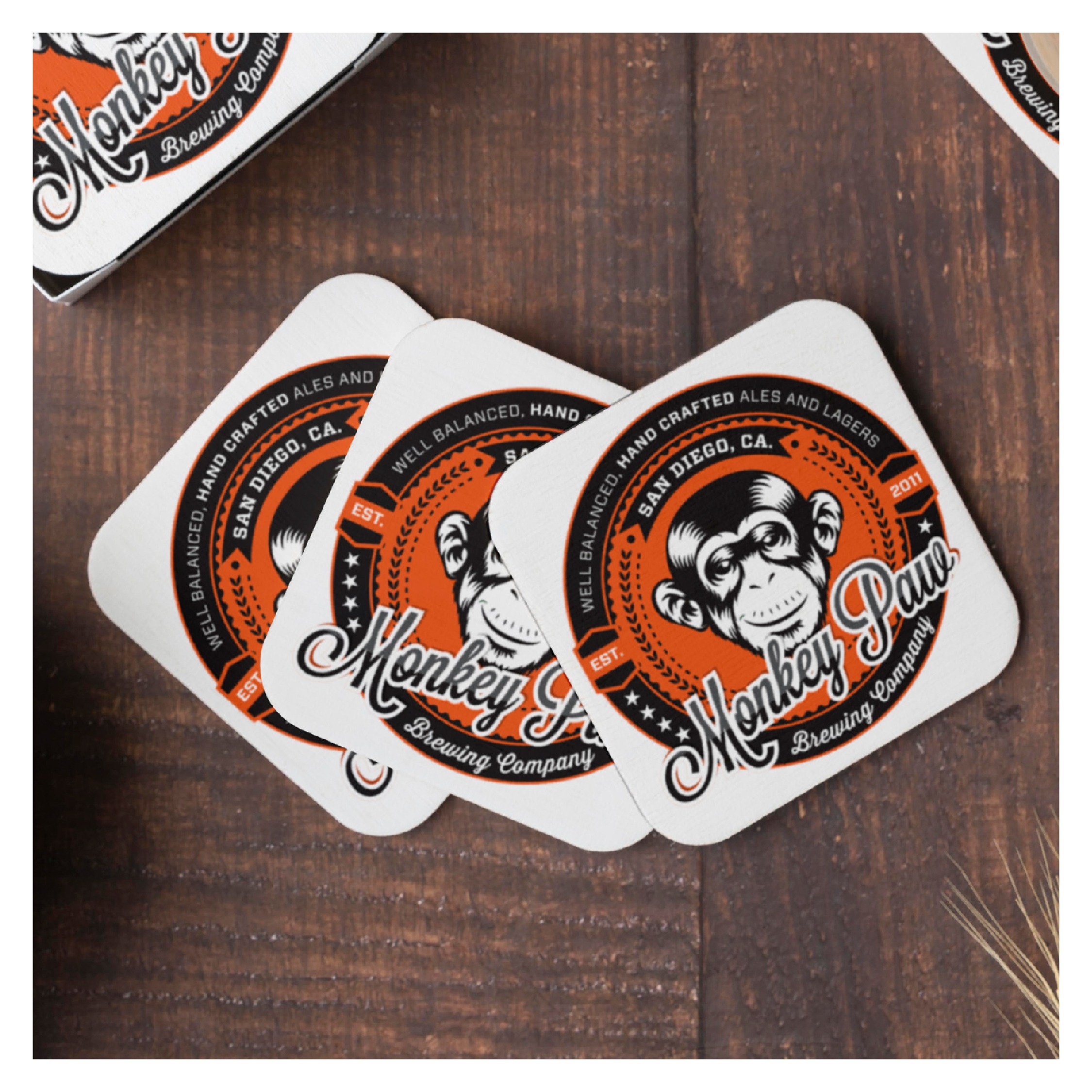
Monkey Paw Brewing – Brand & Packaging Design

Monkey Paw Brewing’s visual identity captures the bold, independent spirit of San Diego’s craft beer scene. The centerpiece logo features a charismatic monkey illustration framed in a vintage badge, giving a nod to traditional brewery emblems while delivering a playful edge.

Each can design builds on the brand’s personality with strong color-blocking and eye-catching typography to differentiate individual brews like Lab Monkey IPA, Sweet Georgia Brown, Oatmeal Pale, and Bonobos Pale Ale. Metallic finishes and crisp detailing enhance shelf appeal, while supporting materials—coasters, delivery van graphics, and limited-edition merchandise—extend the brand into every customer touchpoint. The result is a cohesive system that feels handcrafted yet strikingly modern, perfectly reflecting the brewery’s adventurous approach to craft beer.

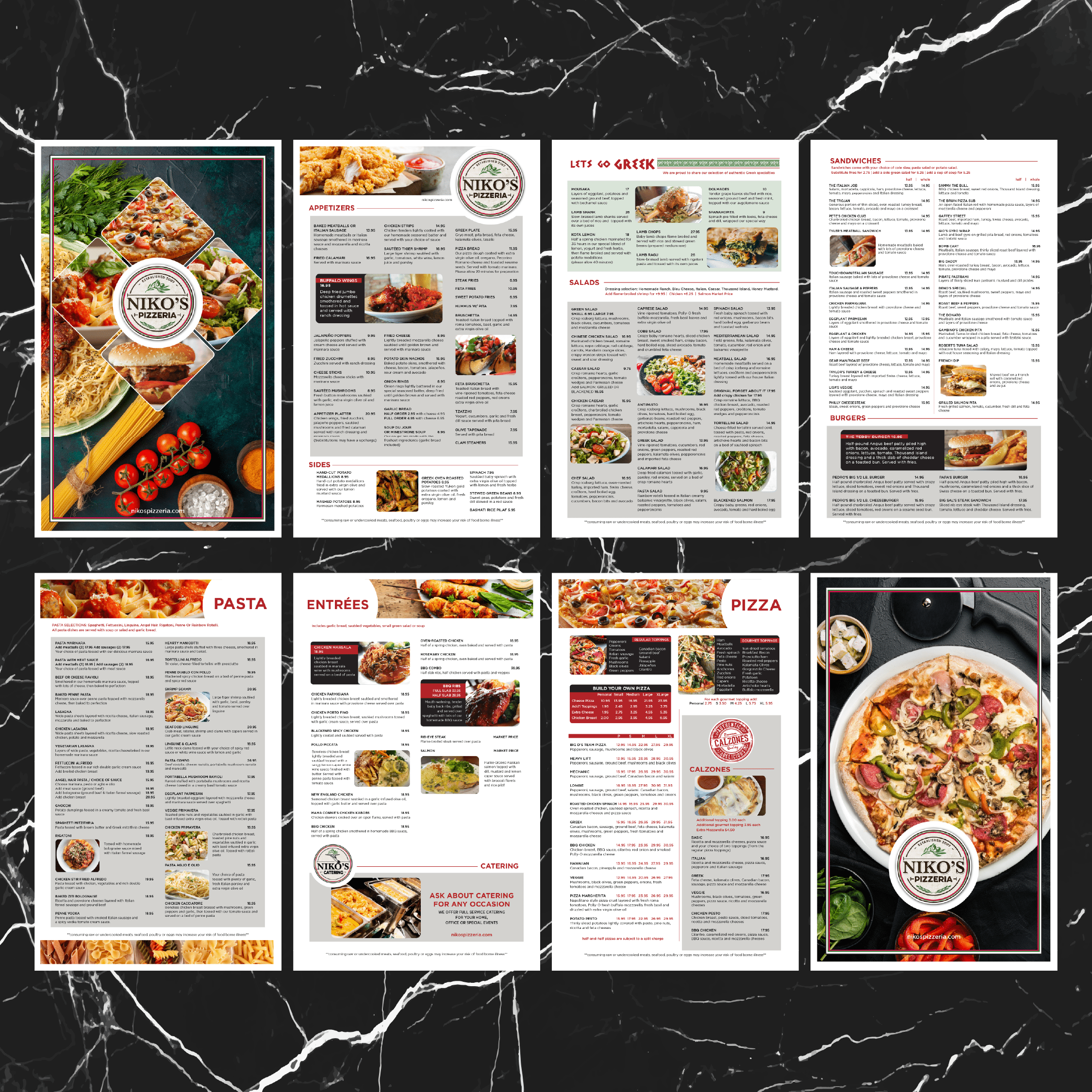
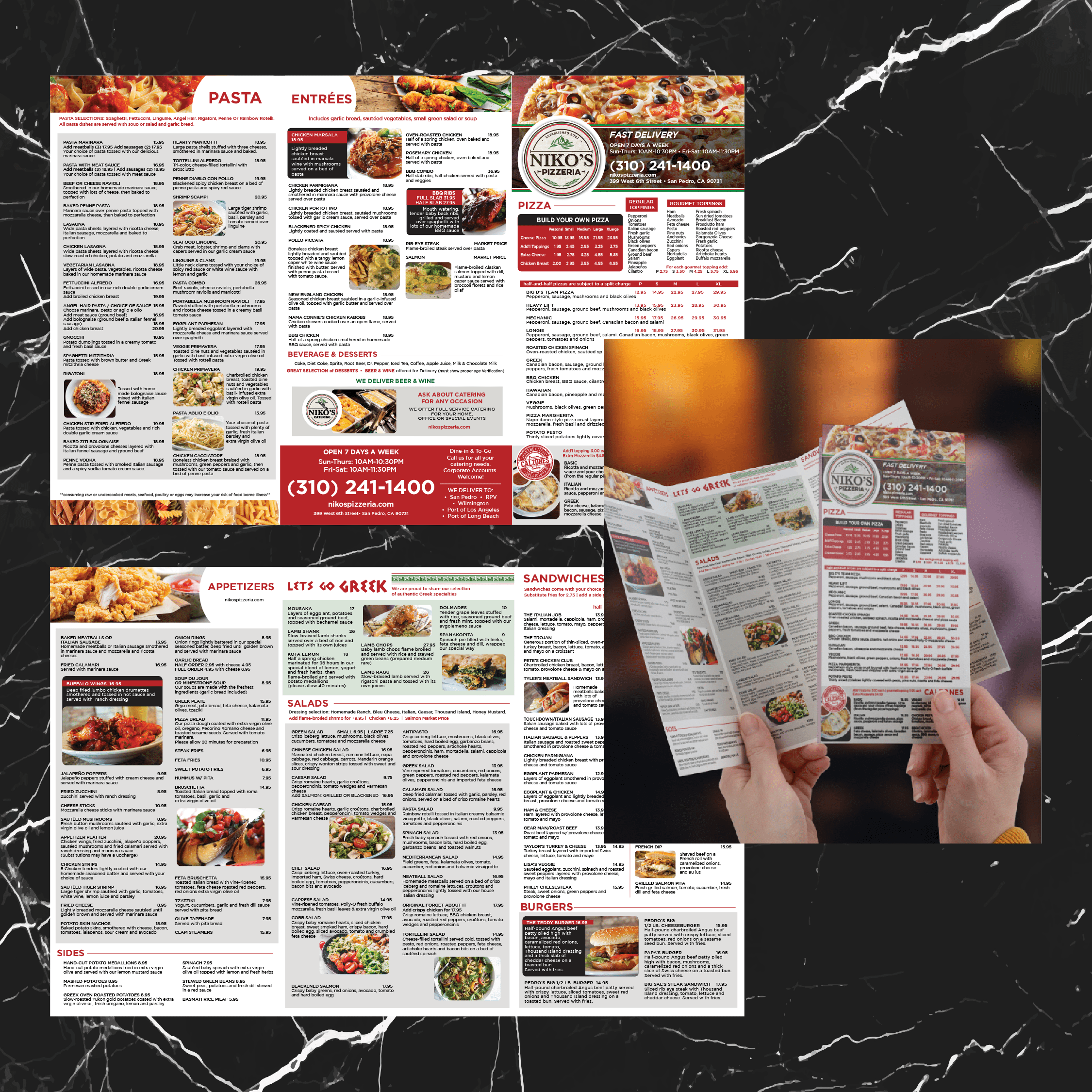
Niko’s Pizzeria – Menu Design Collection

This menu system was created to showcase Niko’s extensive offerings while keeping the layout clean and easy to navigate. Bold section headers, rich food photography, and a warm red-and-black color palette reflect the hearty, welcoming nature of the pizzeria. Multiple formats—dine-in menus, catering pieces, take-out trifold, wine and beverage inserts—were designed as a cohesive family, ensuring the brand feels consistent whether guests are ordering at the table, grabbing delivery, or planning an event. The result is a flexible, visually appetizing set of menus that highlight Niko’s signature dishes and make ordering effortless.

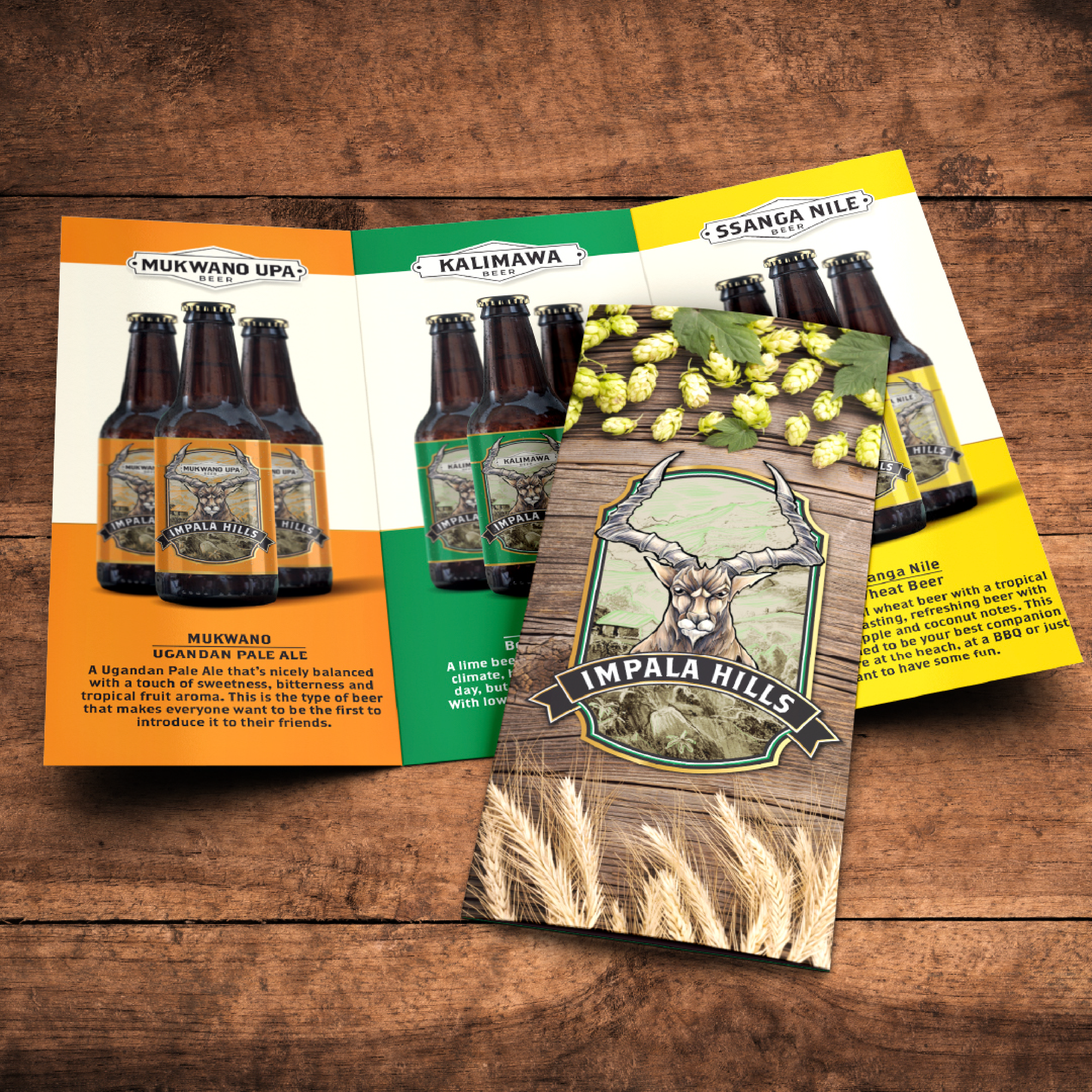
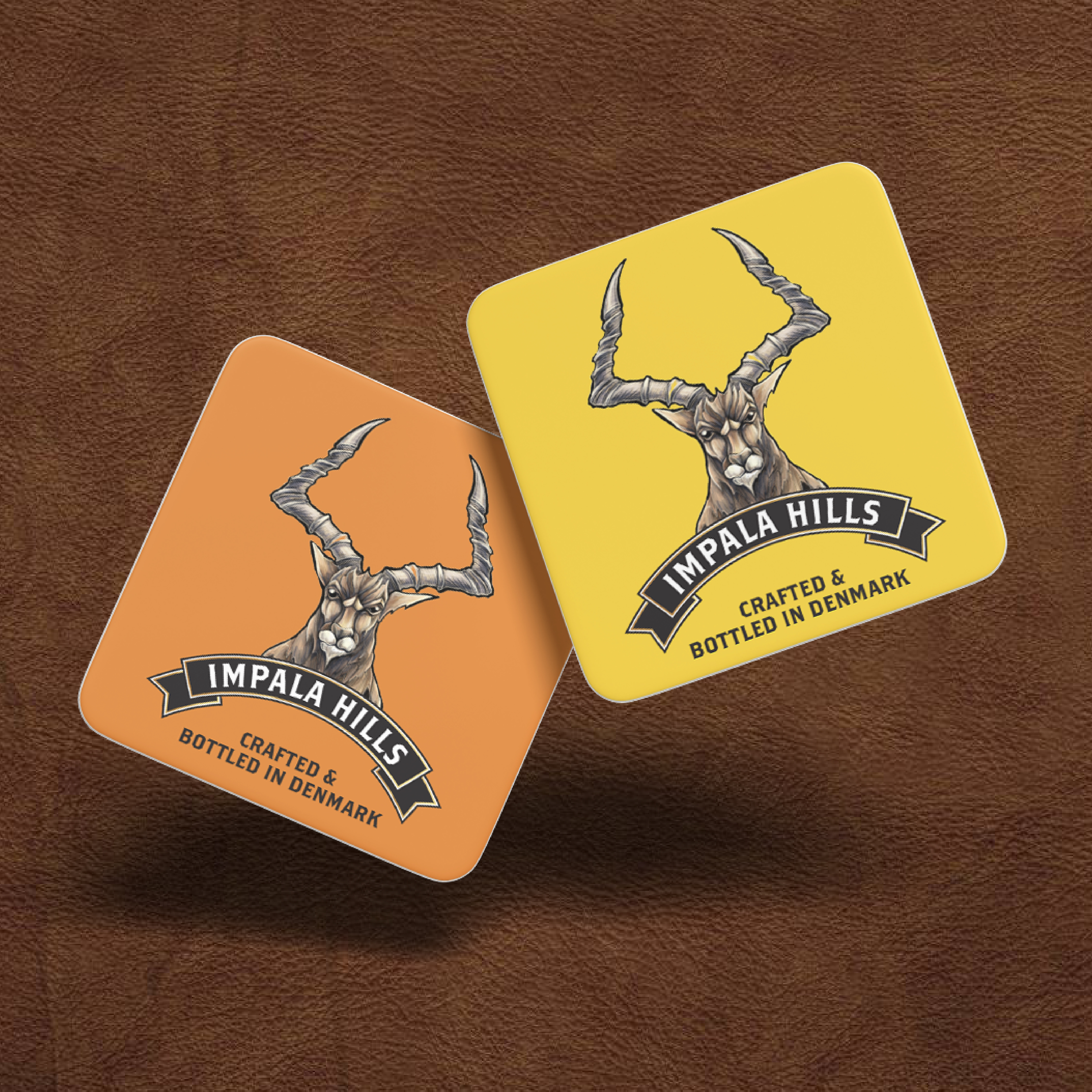
IMPALA HILLS label

The Impala Hills beer label was designed to capture the wild spirit and vibrant character of Ssanga Nile’s craft brew. Centered around a striking impala illustration framed by rugged horns, the design balances bold African iconography with contemporary packaging aesthetics. The rich yellow backdrop commands attention on shelves, while detailed linework and earthy accents convey authenticity and depth. A modern badge layout ensures easy brand recognition, and the cohesive application across bottle and label demonstrates versatility in real-world production. This project highlights my ability to create eye-catching, narrative-driven packaging that tells a story while standing out in competitive beverage markets.

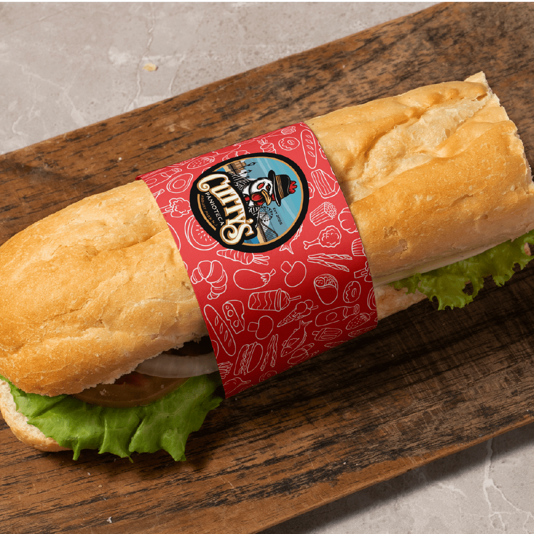
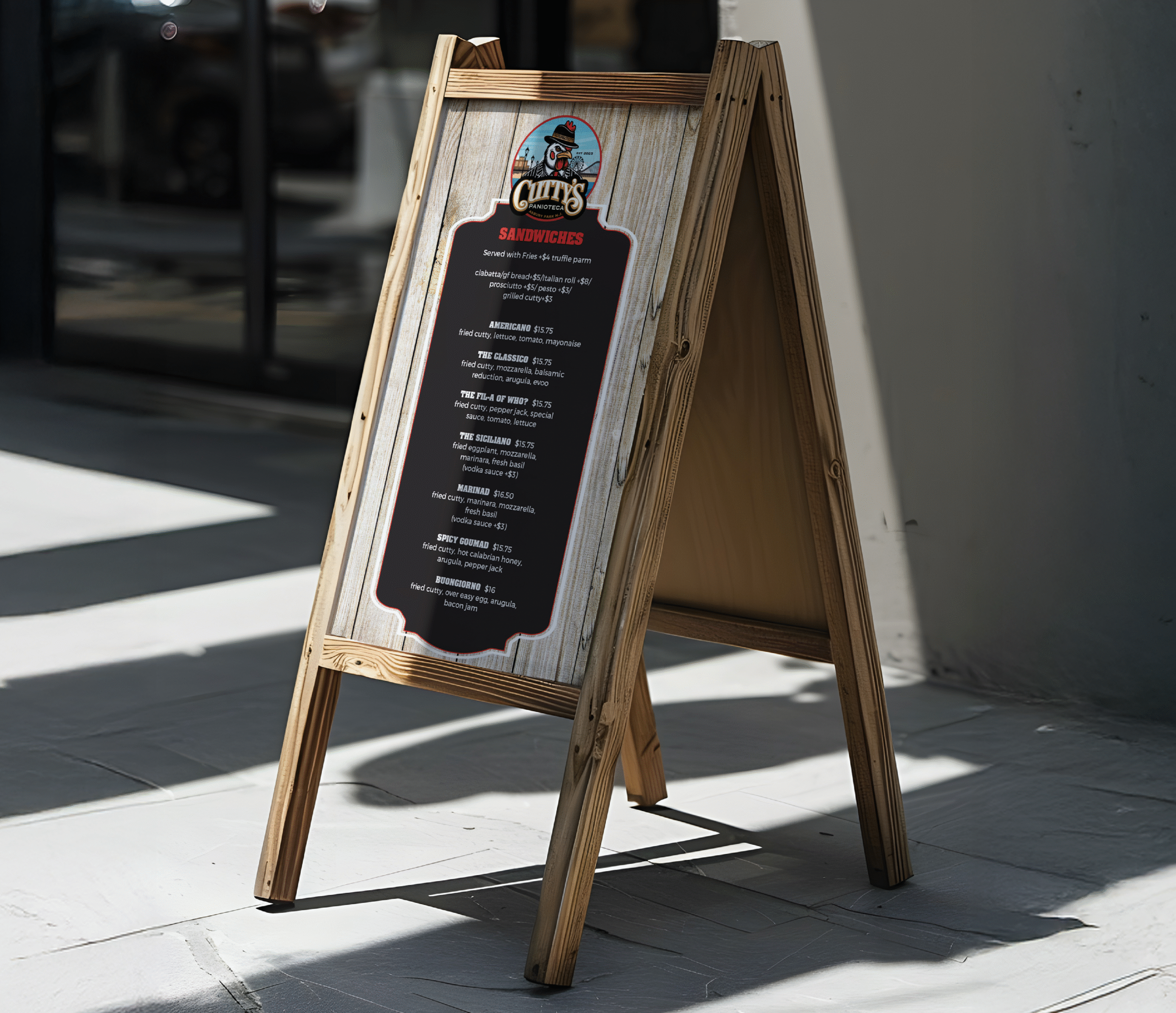
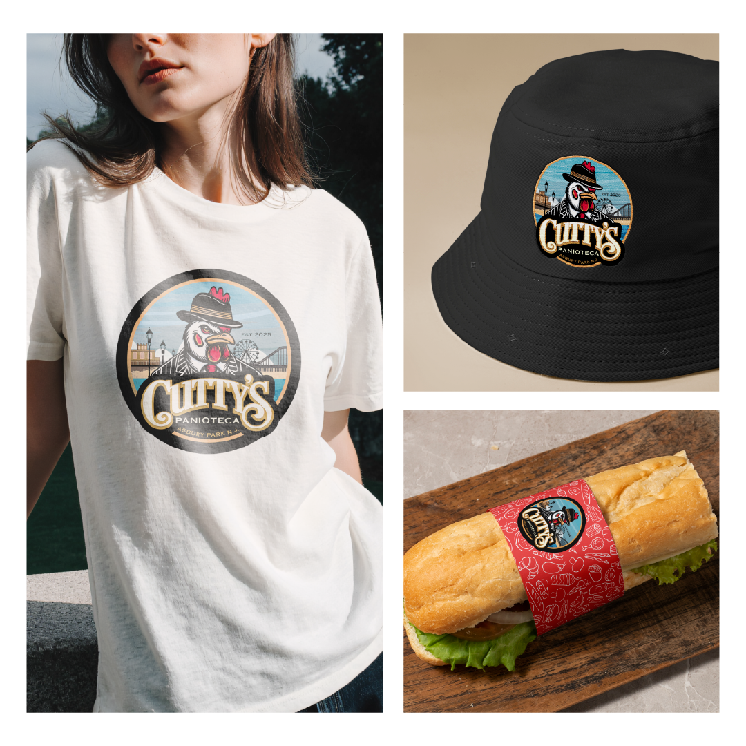
CUTTY'S Logo Design

The Cutty’s logo captures the playful edge of Asbury Park’s boardwalk with a clever mix of grit and charm. A sharply dressed rooster—complete with pinstripe suit and fedora—takes center stage, symbolizing both the restaurant’s bold personality and its Italian-style sandwich heritage. Behind him, iconic boardwalk landmarks, lampposts, and the silhouette of the Ferris wheel evoke the seaside energy of the Jersey Shore. The rich gold and deep black palette, paired with crisp line work, lends a vintage-meets-modern feel that perfectly mirrors Cutty’s creative, streetwise approach to classic sandwiches.

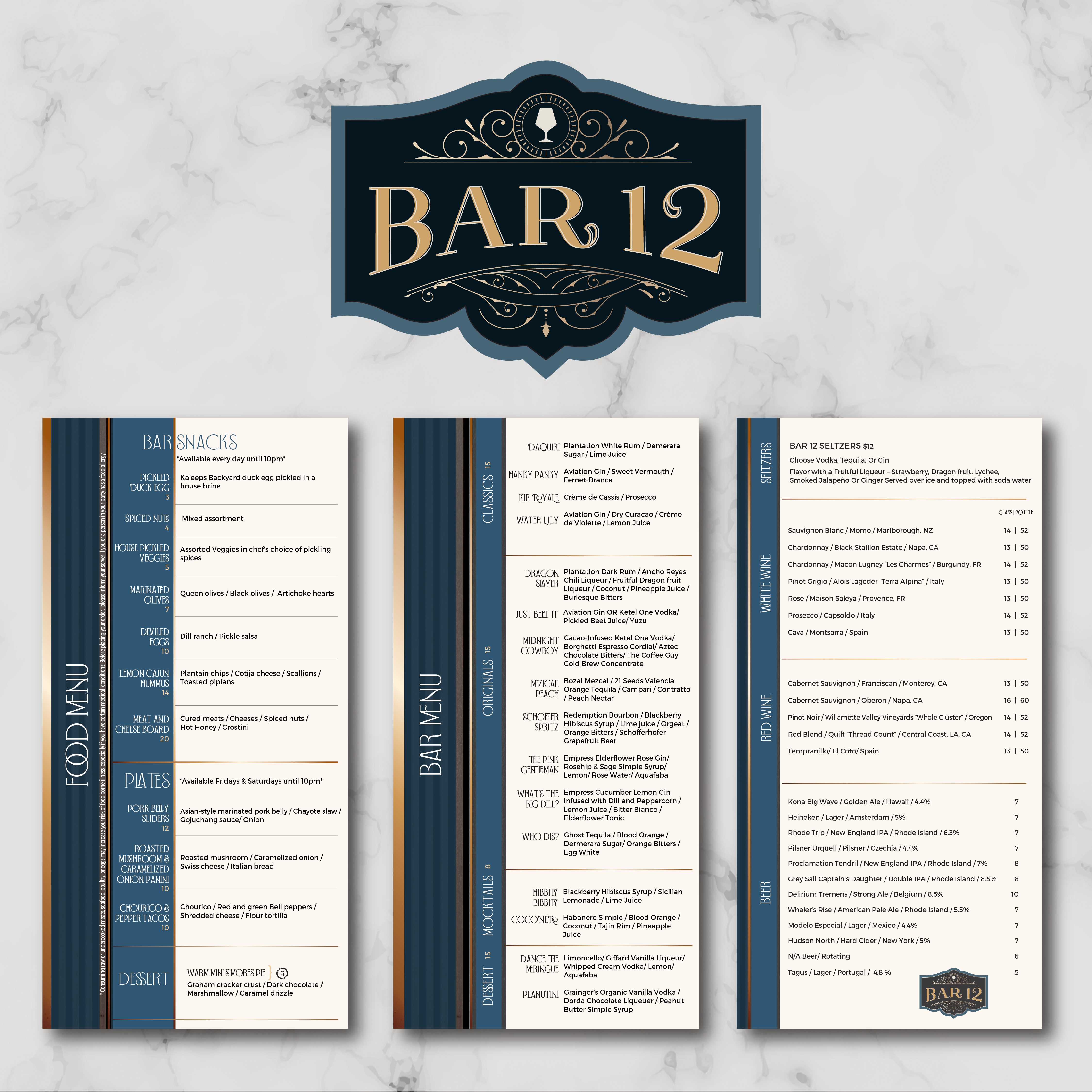
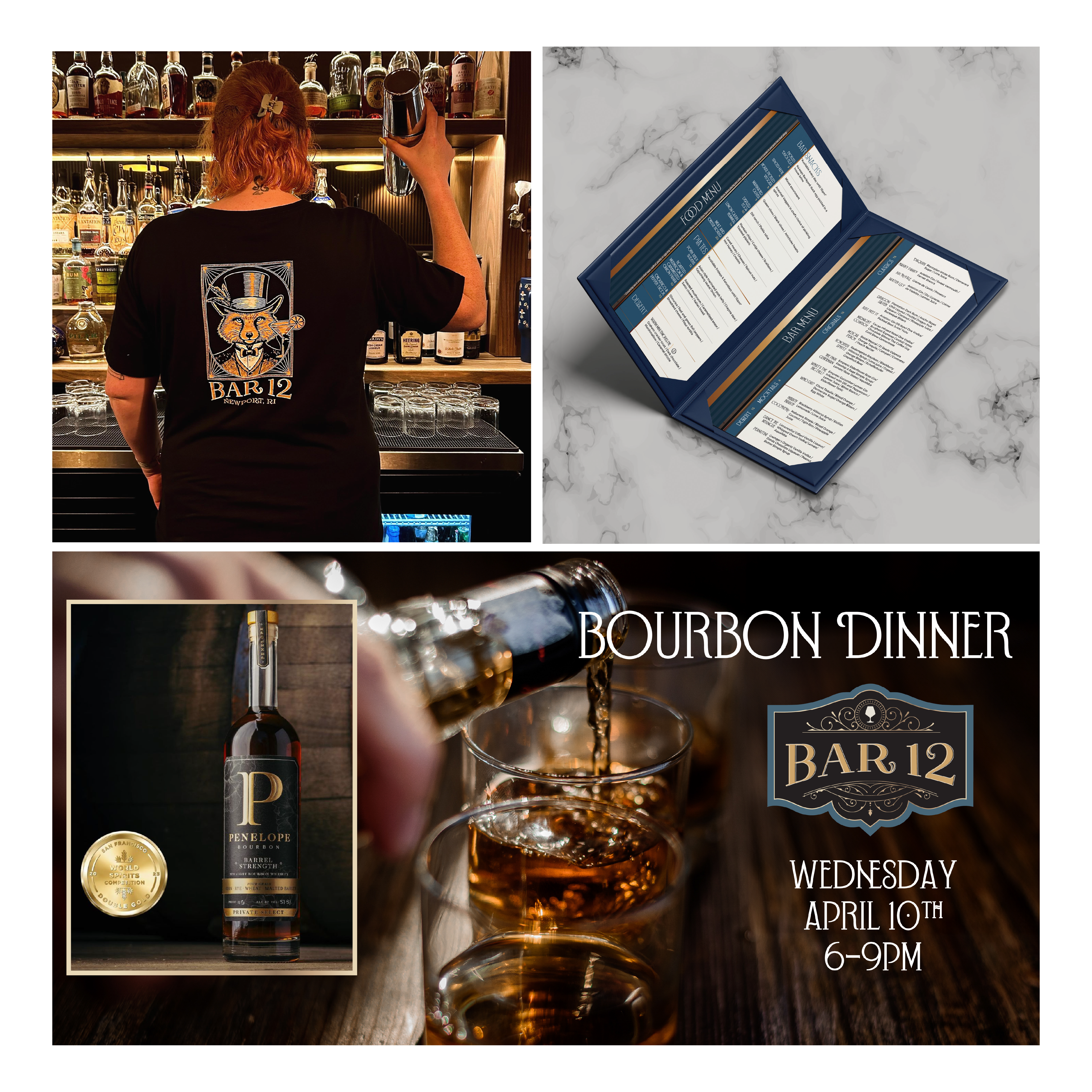
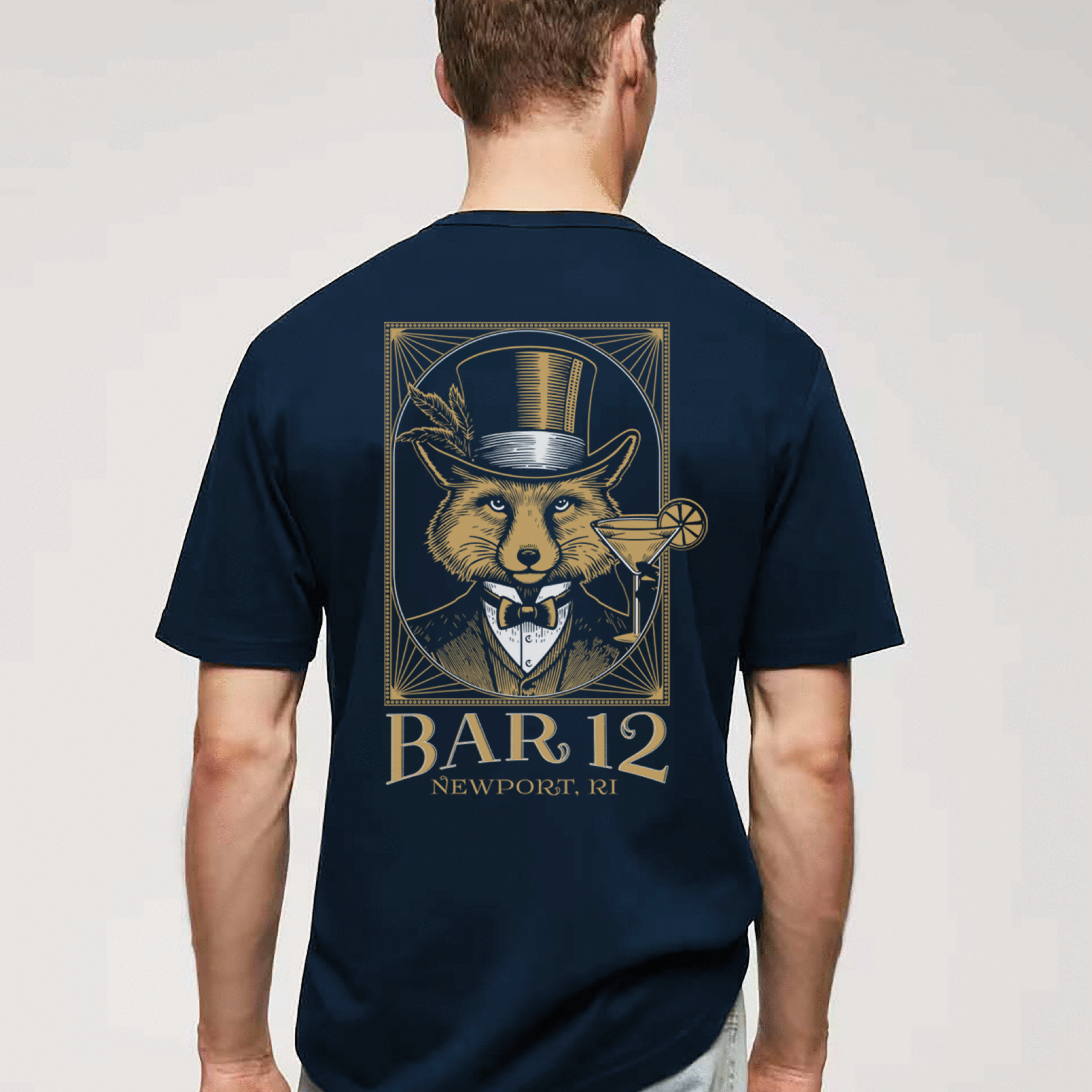
BAR12 Logo/Menu Design

The Bar 12 branding and menu design combine classic sophistication with a modern edge, creating a polished identity for an upscale cocktail destination. The logo features elegant typography framed by delicate scrollwork and a subtle glass silhouette, evoking the refined artistry of craft mixology. A deep navy and warm gold palette reinforces a sense of timeless luxury, while crisp layouts and clean type hierarchies ensure easy readability across both the food and beverage menus. This project showcases our ability to blend elegant branding with functional menu design for clients seeking a distinctive, memorable look. 

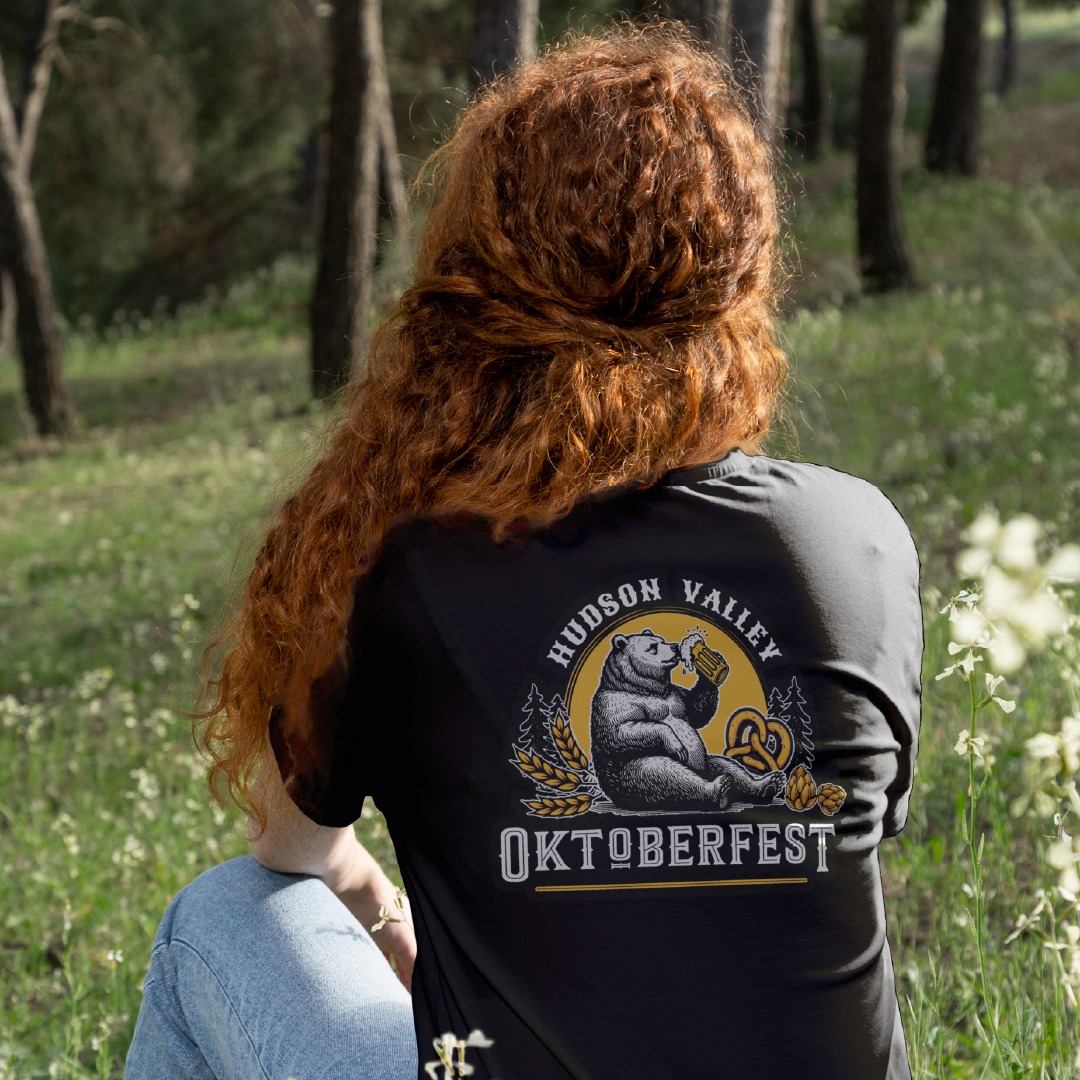
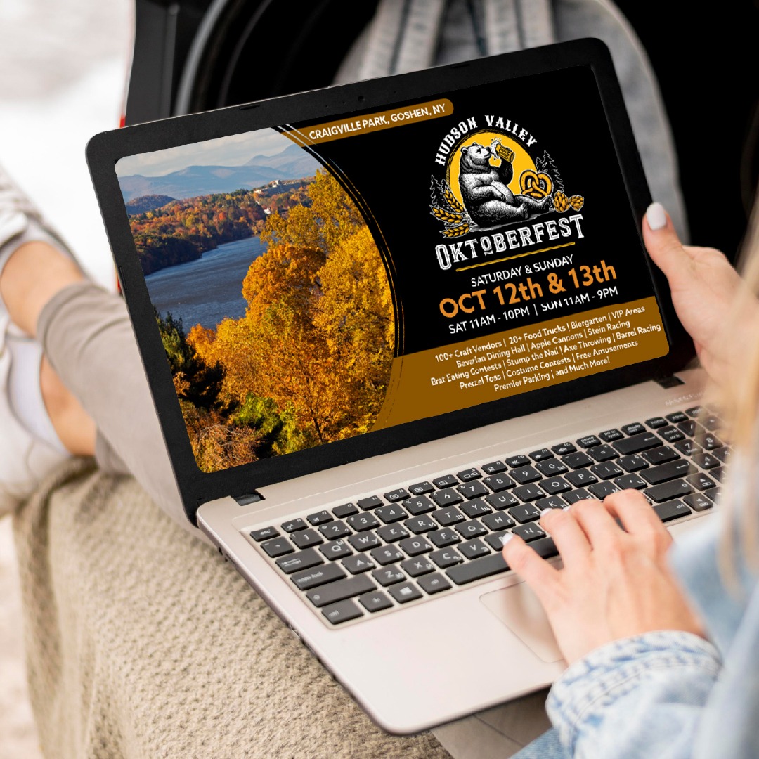
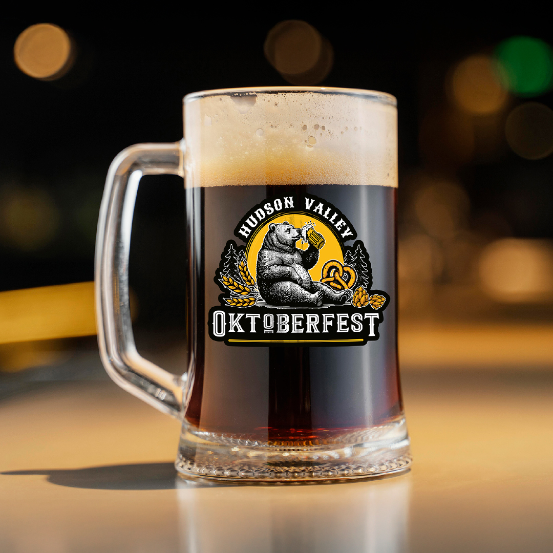
Hudson Valley OKTOBERFEST 

The Hudson Valley Oktoberfest campaign began with the challenge of creating a singular mark that could embody both the rustic charm of the region and the lively spirit of a Bavarian celebration. The resulting logo—a proud bear enjoying a frothy stein beneath a harvest-gold moon—became the cornerstone of a full visual identity. From posters and signage to menus, merchandise, and social media assets, each supporting piece drew from the logo’s rich textures and bold autumn palette, ensuring a cohesive, high-impact presence across every touchpoint of the festival.

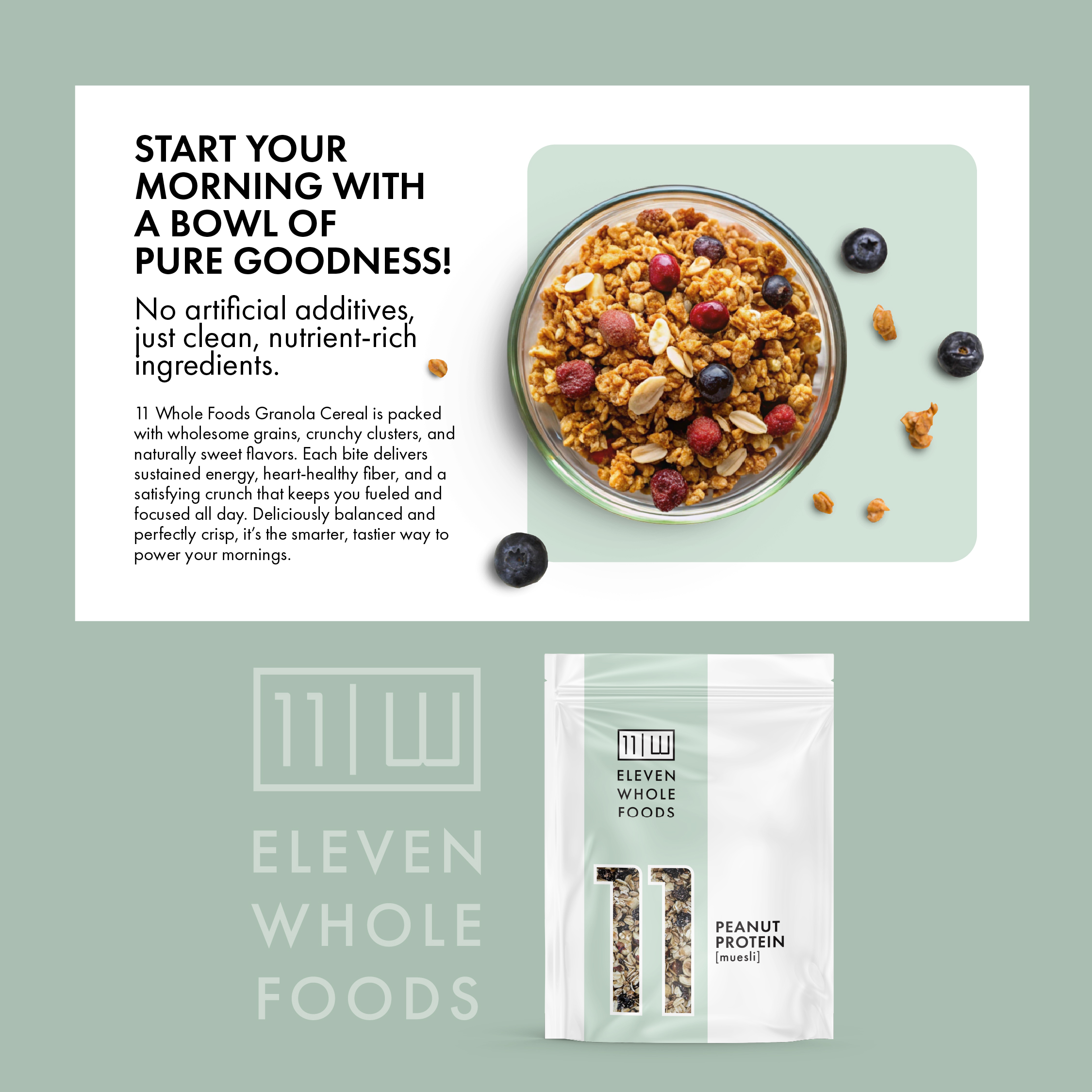
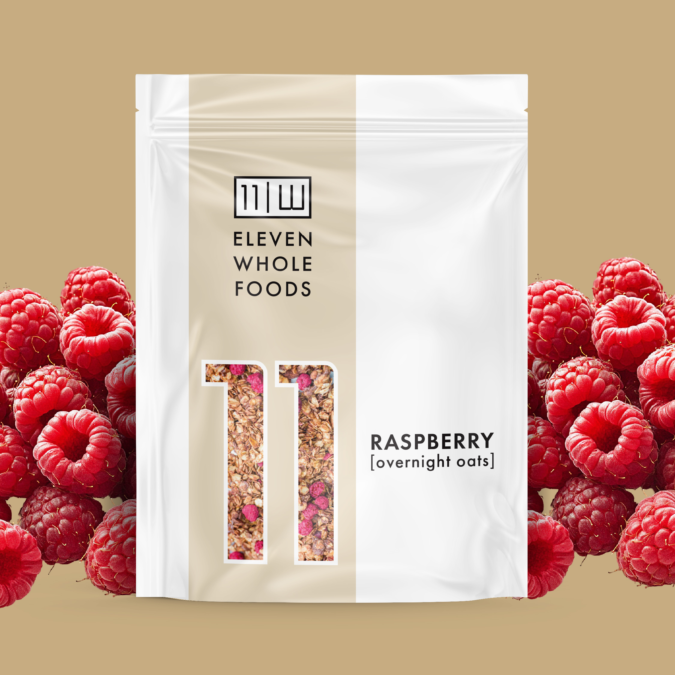
Eleven Whole Foods – Brand & Packaging Design

The Eleven Whole Foods identity was created to celebrate pure ingredients with a modern, confident aesthetic. The logo—a sleek numeric “11” paired with a clean wordmark—communicates balance and simplicity, while the subtle double-line frame nods to both unity and abundance.

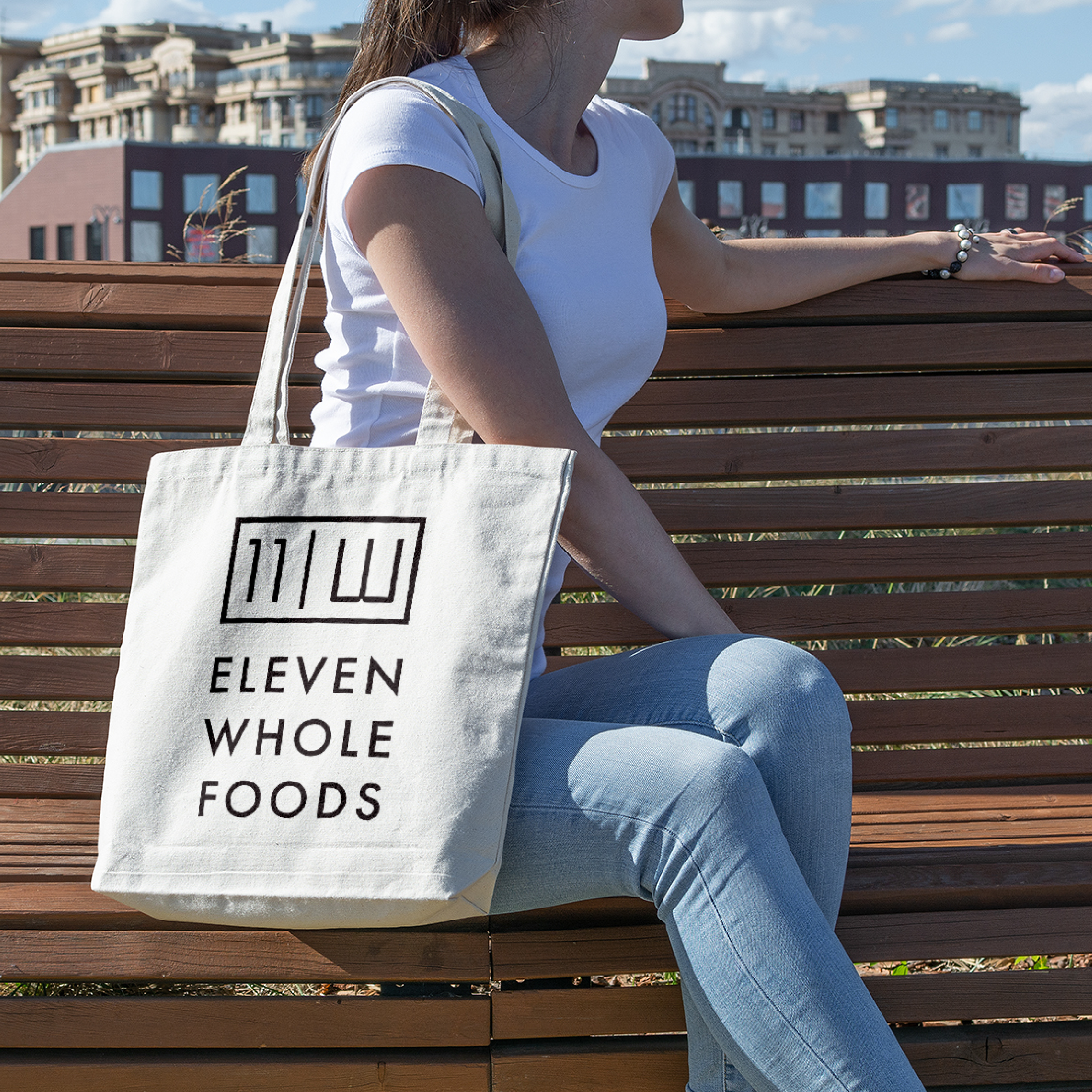
Each package showcases a bold vertical “11” window that reveals the wholesome ingredients inside, letting the product’s natural colors become part of the design. Soft, muted background tones distinguish each flavor—such as Raspberry Overnight Oats, Peanut Protein Muesli, and Maple Macadamia—while maintaining a cohesive, elegant shelf presence. Supporting campaign materials extend the brand into social graphics, tote bags, and lifestyle photography, creating a complete visual system that feels fresh, health-conscious, and effortlessly premium.

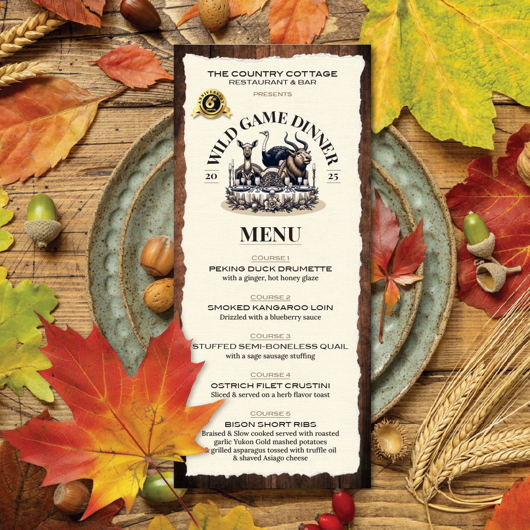
The Country Cottage - Wild Game Night Logo/Menu

The Wild Game Dinner showcased an artfully curated menu of refined, seasonal fare, celebrating the depth and complexity of wild ingredients. To honor this exclusive culinary experience, a bespoke logo was designed with a sophisticated rustic elegance, seamlessly reflecting the restaurant’s elevated yet warmly inviting character.

The Stray Hare Barbershop Logo

This logo was designed for The Stray Hare Barbershop, blending vintage charm with a playful twist. The central illustration features a hand-drawn hare sporting a scarf, creating an approachable, memorable character. Ornamental banners and bold typography evoke the feel of a classic barbershop sign, while the warm gold accents add a touch of sophistication. The combination of traditional elements and quirky illustration helps the brand stand out as both timeless and distinctive